Often in ecological research, we are interested not only in comparing univariate descriptors of communities, like diversity (such as in my previous post), but also in how the constituent species — or the composition — changes from one community to the next.
One common tool to do this is non-metric multidimensional scaling, or NMDS. The goal of NMDS is to collapse information from multiple dimensions (e.g, from multiple communities, sites, etc.) into just a few, so that they can be visualized and interpreted. Unlike other ordination techniques that rely on (primarily Euclidean) distances, such as Principal Coordinates Analysis, NMDS uses rank orders, and thus is an extremely flexible technique that can accommodate a variety of different kinds of data.
Below is a bit of code I wrote to illustrate the concepts behind of NMDS, and to provide a practical example to highlight some R functions that I find particularly useful. Most of the background information and tips come from the excellent manual for the software PRIMER (v6) by Clark and Warwick.
________________________
What is NMDS?
First, let’s lay some groundwork.
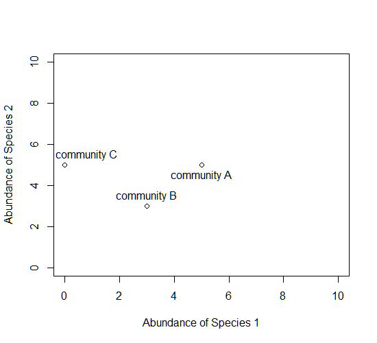
Consider a single axis representing the abundance of a single species. Along this axis, we can plot the communities in which this species appears, based on its abundance within each.

Now consider a second axis of abundance, representing another species. We can now plot each community along the two axes (Species 1 and Species 2).
Now consider a third axis of abundance representing yet another species.
# install.packages("scatterplot3d")
library(scatterplot3d)
d=scatterplot3d(0:10,0:10,0:10,type="n",xlab="Abundance of Species 1",
  ylab="Abundance of Species 2",zlab="Abundance of Species 3"); d
d$points3d(5,5,0); text(d$xyz.convert(5,5,0.5),labels="community A")
d$points3d(3,3,3); text(d$xyz.convert(3,3,3.5),labels="community B")
d$points3d(0,5,5); text(d$xyz.convert(0,5,5.5),labels="community C")

Keep going, and imagine as many axes as there are species in these communities.

The goal of NMDS is to represent the original position of communities in multidimensional space as accurately as possible using a reduced number of dimensions that can be easily plotted and visualized (and to spare your thinker).
How does it work?
NMDS does not use the absolute abundances of species in communities, but rather their rank orders. The use of ranks omits some of the issues associated with using absolute distance (e.g., sensitivity to transformation), and as a result is much more flexible technique that accepts a variety of types of data. (It’s also where the “non-metric” part of the name comes from.)
The NMDS procedure is iterative and takes place over several steps:
- Define the original positions of communities in multidimensional space.
- Specify the number of reduced dimensions (typically 2).
- Construct an initial configuration of the samples in 2-dimensions.
- Regress distances in this initial configuration against the observed (measured) distances.
- Determine the stress, or the disagreement between 2-D configuration and predicted values from the regression. If the 2-D configuration perfectly preserves the original rank orders, then a plot of one against the other must be monotonically increasing. The extent to which the points on the 2-D configuration differ from this monotonically increasing line determines the degree of stress. This relationship is often visualized in what is called a Shepard plot.
- If stress is high, reposition the points in 2 dimensions in the direction of decreasing stress, and repeat until stress is below some threshold.**A good rule of thumb: stress < 0.05 provides an excellent representation in reduced dimensions, < 0.1 is great, < 0.2 is good/ok, and stress < 0.3 provides a poor representation.** To reiterate: high stress is bad, low stress is good!
Additional note: The final configuration may differ depending on the initial configuration (which is often random), and the number of iterations, so it is advisable to run the NMDS multiple times and compare the interpretation from the lowest stress solutions.
To begin, NMDS requires a distance matrix, or a matrix of dissimilarities. Raw Euclidean distances are not ideal for this purpose: they’re sensitive to total abundances, so may treat sites with a similar number of species as more similar, even though the identities of the species are different. They’re also sensitive to species absences, so may treat sites with the same number of absent species as more similar.
Consequently, ecologists use the Bray-Curtis dissimilarity calculation, which has a number of ideal properties:
- It is invariant to changes in units.
- It is unaffected by additions/removals of species that are not present in two communities,
- It is unaffected by the addition of a new community,
- It can recognize differences in total abundances when relative abundances are the same,
Let’s do it in R!
To run the NMDS, we will use the function metaMDS from the vegan package. The function requires only a community-by-species matrix (which we will create randomly).
You should see each iteration of the NMDS until a solution is reached (i.e., stress was minimized after some number of reconfigurations of the points in 2 dimensions). You can increase the number of default iterations using the argument trymax=. which may help alleviate issues of non-convergence. If high stress is your problem, increasing the number of dimensions to k=3 might also help.
example_NMDS=metaMDS(community_matrix,k=2,trymax=100)
You’ll see that metaMDS has automatically applied a square root transformation and calculated the Bray-Curtis distances for our community-by-site matrix.
Let’s examine a Shepard plot, which shows scatter around the regression between the interpoint distances in the final configuration (i.e., the distances between each pair of communities) against their original dissimilarities.
stressplot(example_NMDS)

Large scatter around the line suggests that original dissimilarities are not well preserved in the reduced number of dimensions. Looks pretty good in this case.
Now we can plot the NMDS. The plot shows us both the communities (“sites”, open circles) and species (red crosses), but we don’t know which circle corresponds to which site, and which species corresponds to which cross.
plot(example_NMDS)

We can use the function ordiplot and orditorp to add text to the plot in place of points to make some sense of this rather non-intuitive mess.
ordiplot(example_NMDS,type="n")
orditorp(example_NMDS,display="species",col="red",air=0.01)
orditorp(example_NMDS,display="sites",cex=1.25,air=0.01)

That’s it! There’s a few more tips and tricks I want to demonstrate.
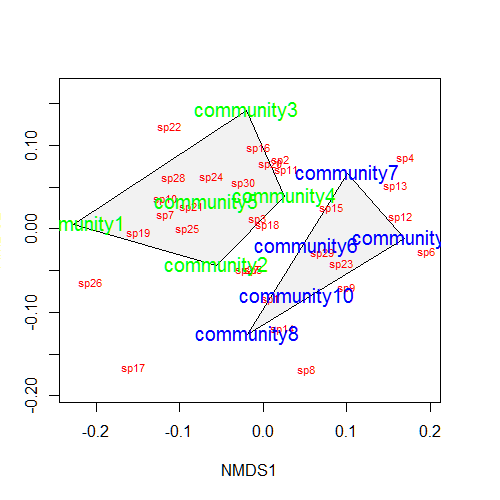
Let’s suppose that communities 1-5 had some treatment applied, and communities 6-10 a different treatment. We can draw convex hulls connecting the vertices of the points made by these communities on the plot. I find this an intuitive way to understand how communities and species cluster based on treatments.
treat=c(rep("Treatment1",5),rep("Treatment2",5))
ordiplot(example_NMDS,type="n")
ordihull(example_NMDS,groups=treat,draw="polygon",col="grey90",label=F)
orditorp(example_NMDS,display="species",col="red",air=0.01)
orditorp(example_NMDS,display="sites",col=c(rep("green",5),rep("blue",5)),
   air=0.01,cex=1.25)
One can also plot “spider graphs” using the function orderspider, ellipses using the function ordiellipse, or a minimum spanning tree (MST) using ordicluster which connects similar communities (useful to see if treatments are effective in controlling community structure).

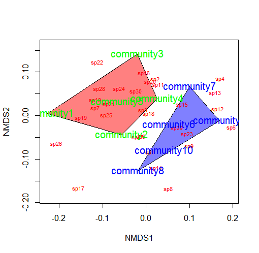
You could also color the convex hulls by treatment.
# First, create a vector of color values corresponding of the
# same length as the vector of treatment values
colors=c(rep("red",5),rep("blue",5))
ordiplot(example_NMDS,type="n")
#Plot convex hulls with colors baesd on treatment
for(i in unique(treat)) {
  ordihull(example_NMDS$point[grep(i,treat),],draw="polygon",
   groups=treat[treat==i],col=colors[grep(i,treat)],label=F) }
orditorp(example_NMDS,display="species",col="red",air=0.01)
orditorp(example_NMDS,display="sites",col=c(rep("green",5),
  rep("blue",5)),air=0.01,cex=1.25)
*You may wish to use a less garish color scheme than I
If the treatment is continuous, such as an environmental gradient, then it might be useful to plot contour lines rather than convex hulls. We can simply make up some, say, elevation data for our original community matrix and overlay them onto the NMDS plot using ordisurf:
Which produces the following plot:
 You could even do this for other continuous variables, such as temperature.
________________________
The full example code (annotated, with examples for the last several plots) is available below:
# Non-metric multidimensional scaling (NMDS) is one tool commonly used to
# examine community composition

# Let's lay some conceptual groundwork
# Consider a single axis of abundance representing a single species:
plot(0:10,0:10,type="n",axes=F,xlab="Abundance of Species 1",ylab="")
axis(1)
# We can plot each community on that axis depending on the abundance of
# species 1 within it
points(5,0); text(5.5,0.5,labels="community A")
points(3,0); text(3.2,0.5,labels="community B")
points(0,0); text(0.8,0.5,labels="community C")

# Now consider a second axis of abundance representing a different
# species
# Communities can be plotted along both axes depending on the abundance of
# species within it
plot(0:10,0:10,type="n",xlab="Abundance of Species 1",
     ylab="Abundance of Species 2")
points(5,5); text(5,4.5,labels="community A")
points(3,3); text(3,3.5,labels="community B")
points(0,5); text(0.8,5.5,labels="community C")

# Now consider a THIRD axis of abundance representing yet another species
# (For this we're going to need to load another package)
# install.packages("scatterplot3d")
library(scatterplot3d)
d=scatterplot3d(0:10,0:10,0:10,type="n",xlab="Abundance of Species 1",
                ylab="Abundance of Species 2",
                zlab="Abundance of Species 3"); d
d$points3d(5,5,0); text(d$xyz.convert(5,5,0.5),labels="community A")
d$points3d(3,3,3); text(d$xyz.convert(3,3,3.5),labels="community B")
d$points3d(0,5,5); text(d$xyz.convert(0,5,5.5),labels="community C")

# Now consider as many axes as there are species S (obviously we cannot
# visualize this beyond 3 dimensions)
# Hopefully your head didn't explode

# The goal of NMDS is to represent the original position of communities in
# multidimensional space as accurately as possible using a reduced number
# of dimensions that can be easily plotted and visualized

# NMDS does not use the absolute abundances of species in communities, but
# rather their RANK ORDER!
# The use of ranks omits some of the issues associated with using absolute
# distance (e.g., sensitivity to transformation), and as a result is much
# more flexible technique that accepts a variety of types of data
# (It is also where the "non-metric" part of the name comes from)

# The NMDS procedure is iterative and takes place over several steps:
# (1) Define the original positions of communities in multidimensional
# space
# (2) Specify the number m of reduced dimensions (typically 2)
# (3) Construct an initial configuration of the samples in 2-dimensions
# (4) Regress distances in this initial configuration against the observed
# (measured) distances
# (5) Determine the stress (disagreement between 2-D configuration and
# predicted values from regression)
# If the 2-D configuration perfectly preserves the original rank
# orders, then a plot ofone against the other must be monotonically
# increasing. The extent to which the points on the 2-D configuration
# differ from this monotonically increasing line determines the
# degree of stress (see Shepard plot)
# (6) If stress is high, reposition the points in m dimensions in the
#direction of decreasing stress, and repeat until stress is below
#some threshold

# Generally, stress < 0.05 provides an excellent represention in reduced
# dimensions, < 0.1 is great, < 0.2 is good, and stress > 0.3 provides a
# poor representation

# NOTE: The final configuration may differ depending on the initial
# configuration (which is often random) and the number of iterations, so
# it is advisable to run the NMDS multiple times and compare the
# interpretation from the lowest stress solutions

# To begin, NMDS requires a distance matrix, or a matrix of
# dissimilarities
# Raw Euclidean distances are not ideal for this purpose: they are
# sensitive to totalabundances, so may treat sites with a similar number
# of species as more similar, even though the identities of the species
# are different
# They are also sensitive to species absences, so may treat sites with
# the same number of absent species as more similar

# Consequently, ecologists use the Bray-Curtis dissimilarity calculation,
# which has many ideal properties:
# It is invariant to changes in units
# It is unaffected by additions/removals of species that are not
# present in two communities
# It is unaffected by the addition of a new community
# It can recognize differences in total abudnances when relative
# abundances are the same

# To run the NMDS, we will use the function `metaMDS` from the vegan
# package
#install.packages("vegan")
library(vegan)
# `metaMDS` requires a community-by-species matrix
# Let's create that matrix with some randomly sampled data
set.seed(2)
community_matrix=matrix(sample(1:100,300,replace=T),nrow=10,
                        dimnames=list(paste("community",1:10,sep=""),
                                      paste("sp",1:30,sep="")))

# The function `metaMDS` will take care of most of the distance
# calculations, iterative fitting, etc. We need simply to supply:
example_NMDS=metaMDS(community_matrix, # Our community-by-species matrix
                     k=2) # The number of reduced dimensions
# You should see each iteration of the NMDS until a solution is reached
# (i.e., stress was minimized after some number of reconfigurations of
# the points in 2 dimensions). You can increase the number of default
# iterations using the argument "trymax=##"
example_NMDS=metaMDS(community_matrix,k=2,trymax=100)

# And we can look at the NMDS object
example_NMDS # metaMDS has automatically applied a square root
# transformation and calculated the Bray-Curtis distances for our
# community-by-site matrix
# Let's examine a Shepard plot, which shows scatter around the regression
# between the interpoint distances in the final configuration (distances
# between each pair of communities) against their original dissimilarities
stressplot(example_NMDS)
# Large scatter around the line suggests that original dissimilarities are
# not well preserved in the reduced number of dimensions

#Now we can plot the NMDS
plot(example_NMDS)
# It shows us both the communities ("sites", open circles) and species
# (red crosses), but we  don't know which are which!

# We can use the functions `ordiplot` and `orditorp` to add text to the
# plot in place of points
ordiplot(example_NMDS,type="n")
orditorp(example_NMDS,display="species",col="red",air=0.01)
orditorp(example_NMDS,display="sites",cex=1.25,air=0.01)

# There are some additional functions that might of interest
# Let's suppose that communities 1-5 had some treatment applied, and
# communities 6-10 a different treatment
# We can draw convex hulls connecting the vertices of the points made by
# these communities on the plot
# First, let's create a vector of treatment values:
treat=c(rep("Treatment1",5),rep("Treatment2",5))
ordiplot(example_NMDS,type="n")
ordihull(example_NMDS,groups=treat,draw="polygon",col="grey90",
         label=FALSE)
orditorp(example_NMDS,display="species",col="red",air=0.01)
orditorp(example_NMDS,display="sites",col=c(rep("green",5),rep("blue",5)),
         air=0.01,cex=1.25)
# I find this an intuitive way to understand how communities and species
# cluster based on treatments
# One can also plot ellipses and "spider graphs" using the functions
# `ordiellipse` and `orderspider` which emphasize the centroid of the
# communities in each treatment

# Another alternative is to plot a minimum spanning tree (from the
# function `hclust`), which clusters communities based on their original
# dissimilarities and projects the dendrogram onto the 2-D plot
ordiplot(example_NMDS,type="n")
orditorp(example_NMDS,display="species",col="red",air=0.01)
orditorp(example_NMDS,display="sites",col=c(rep("green",5),rep("blue",5)),
         air=0.01,cex=1.25)
ordicluster(example_NMDS,hclust(vegdist(community_matrix,"bray")))
# Note that clustering is based on Bray-Curtis distances
# This is one method suggested to check the 2-D plot for accuracy

# You could also plot the convex hulls, ellipses, spider plots, etc. colored based on the treatments
# First, create a vector of color values corresponding of the same length as the vector of treatment values
colors=c(rep("red",5),rep("blue",5))
ordiplot(example_NMDS,type="n")
#Plot convex hulls with colors baesd on treatment
for(i in unique(treat)) {
  ordihull(example_NMDS$point[grep(i,treat),],draw="polygon",groups=treat[treat==i],col=colors[grep(i,treat)],label=F) }
orditorp(example_NMDS,display="species",col="red",air=0.01)
orditorp(example_NMDS,display="sites",col=c(rep("green",5),rep("blue",5)),
         air=0.01,cex=1.25)

# If the treatment is a continuous variable, consider mapping contour
# lines onto the plot
# For this example, consider the treatments were applied along an
# elevational gradient
# We can define random elevations for previous example
elevation=runif(10,0.5,1.5)
# And use the function ordisurf to plot contour lines
ordisurf(example_NMDS,elevation,main="",col="forestgreen")
# Finally, we want to display species on plot
orditorp(example_NMDS,display="species",col="grey30",air=0.1,cex=1)

I am phd student at Tehran university, Iran. I need paper fpr definition of N-MDS. Guide me, please.
Thanks
Any statistical textbook will do!
the text are closed to each other, and even some are covered by each other, is there any good way to solve this problem?
Try the
air =argument inorditorp!I change the air=argument, then below is the result. It doesn’t work.
****
> orditorp(nmds,display=”sites”,cex=1.25,air=argument)
Error in orditorp(nmds, display = “sites”, cex = 1.25, air = argument) :
object ‘argument’ not found
******
See
?orditorp, specifically:air
Amount of empty space between text labels. Values <1 allow overlapping text.
Thanks, I would try to set priority parameter.
Is there any difference between 2 D and 3D in NMDS .in Most of the biology papers NMDS with 2Dimension is used..Before going to NMDS K-MEAN analysis is need or not?
please guide me
Thanks
jasna vijayan
Yes, its entirely possible that 2 vs 3 dimensions will have a big influence on the inferences from the NMDS. Two dimensions is often used because its easier to visualize and present in a publication but I have seen 3-d presentations done well (and many done poorly). K-means clustering will provide different inferences to NMDS in that it will identify natural groupings in your data. You could in theory overlay those on the NMDS points. Hope this helps! Cheers, Jon
Thanks Jon…so in publication point of view 2D is ok
Hi Jon,
Is there a script command to get the correlations of the species data with the first and second NMDS axes?
Thanks!
Hi Jon,
I’m running metaMDS() and specifying k=3. Is there a way to plot three dimensions in three 2D graphs? E.g. one graph of NMDS1 vs. NMDS2, one graph of NMDS1 vs. NMDS3, and one graph of NMDS2 vs. NMDS3.
Thanks!
Sarah
Hi Sarah, Try the
scatterplot3dpackage, specifically the?plot3dfunction. Cheers, JonI have been trying to find a clear, simple explanation that goes through taking an ecological dataset through the process of nMDS graphing in R and your post has been so incredibly helpful! Thank you for putting it together and sharing.
Fantastic tutorial!
I’m just wondering, what one should do if they have species of an unknown group in their data set. Would I be able to use this? For example, I am dealing with a data set of grasshopper species among different communities. All of the grasshoppers were identified to species except for some of a genus that is particularly hard to identify at it’s earliest developmental stages. Thus, those have all been grouped together. Would it be safest to omit them? Should I omit all grasshoppers of all species below the 3rd instar? Or should I leave them as their own “species” group. Or can I even use this at all in this case?
Perhaps a very useful item to add to the tutorial would be “where there be dragons with this” aka what people should be aware of in performing NMDS.
Thanks for the help 🙂
Hi The Bug,
Its hard to say. Do you want these “unidentified” species to influence your interpretation of differences between communities? In other words, are they unidentified because they are unimportant (e.g., non-target) or because they were too destroyed to confidently ID or because they have difficult taxonomy? In all but the last case, I would probably not include them. Same goes for developmental stages: unless you are specifically interested in how the ontogenological composition changes among sites, then I would leave them out. If you treat them as separate columns the algorithm will view them as wholly independent species, which is not correct.
Heh, one day I may revisit the tutorial and add some dragons but alas, too little time!
Cheers,
Jon
Thanks, this is such a nice guide
Hi,
How can I change the treatment commands?
For example here:
treat=c(rep(“Treatment1”,5),rep(“Treatment2”,5))
I would like to replace them with pH and Conductivity instead.
I am very new with R and any help and advice is much appreciated 🙂
Hi Nas, Simply replace “Treatment1” and “Treatment2” with “pH” and “Conductivity”. Cheers, Jon
How to create a plot in 3D?
thank you very much
Hi there! I found an analyses from a NMDS in a paper, but I can’t find the way to do it.
I copy you teh explanation in the methods of that paper:
“we tested statistically whether the community composition of any of the ecosystem age groups was more homogenous than the composition among all islands. This was done for each ecosystem age group by joining the points on the plot by lines to construct minimum convex hulls, and testing whether the area of any of the group-specific hulls was smaller than random joining of points into three groups. Values of P based on 999 permutations were reported.”
Do you have any idea about the test to get that? thanks!!!
To be honest, I have never seen that before. I would use `betadisper` or `adonis` in the `vegan` package to test for differences among groups. As far as I know, neither of these procedures construct convex hulls. Hope this helps! Cheers, Jon
Hi Jon
Many thanks for the blog.
I have a related question. Is any way to calculate any “p-value” from this analysis? Or any measure of “discrimination” among clusters (if any)?
thanks again!!
F
The function
pamkin thefpcpackage will calculate the optimal number of clusters and use the Duda-Hart test to confirm. Hope this helps! JHi Jon, many thanks for the information. It is really superbly helpful. I hope you write a whole book on stats for ecologists some day. I’m using NMDS for the first time. I got a 2D solution with low stress values and I grouped the communities using hierarchical cluster analysis. A more senior ecologist (who champions DCA and always asks during conferences why am I not using it) said the ordination and groupings is wrong due to two groups overlapping on the ordination diagram when colour coded. I know from my knowledge of the sites and through ISA and MRPP that the groupings are sensible and statistically significant (MRPP). It might be a silly question but is overlap in groups in the 2D ordination diagram possible???
Hi Louise,
Thanks for the kind words! Overlap between the two groups is not only possible but common. Given adequate reproduction in reduced dimensions (i.e., a low stress value) this would indicate that the composition and relative abundances of the communities are not radically different between some data points. If you are looking at, for instance, the community before and after a disturbance, this might actually be a highly desirable result. I wouldn’t worry about a small overlap with statistically significant groupings, as you have here, because as you point out the groups make sense ecologically.
With respect to DCA and other kinds of canonical ordination, you may wish to share the following reference with your colleague:
Questionable Multivariate Statistical Inference in Wildlife Habitat and Community Studies
The point is that if the results jive with your intuition and observation about the system, that is far more valuable than statistical tests, which are informative but just as often driven by spurious correlations and confounding influence.
Cheers,
Jon
Hello Jon,
Thanks for a thorough explanation.
I have a morphometric data for 4 species (data set similar to “iris” data in R). I want to see if these morphometric characters can differentiate the species (i.e, species come out as separate clusters). I did make the plot following your code. I can see most of the characters forming a more or less tight cluster and when I map species on them they come out as different clusters. How does species form separate clusters when there are no obvious separate clusters in characters?
Also the characters which are inside the polygon, are they important characters for that species? Help me with interpretation.
Since the data used in metaMDS is species abundance, I don’t know if it can be applied to morphometric data (quantitative and qualitative). For now I have number-coded qualitative data to make it numeric.
Thanks a lot.
Hi Preeti — other techniques, like cluster analysis or machine learning (see the post here: https://jonlefcheck.net/2015/02/06/a-practical-guide-to-machine-learning-in-ecology/ ) may be more appropriate for your analysis. Have a look and let me know if you any questions! Cheers, Jon
Jon: Is there a way to plot (show) some of the ordination ellipses (or polygons) on a 2D graph but not plot (or hide/make transparent) the others? Thanks.
Hi Paul, check out some of the code to port the points over to
ggplot2in the comments. You may find it a more flexible alternative that can achieve what you want to visualize! Cheers, JonHi Jon, top shelf summary of NMS, thanks :). I have seen that breakdown of stress values and their acceptability before, but not in a formal textbook. Any text I have seen has different values appropriate for say PCORD. Where do you get the breakdown of acceptable stress scores from?
Hi Graham, I pulled these values from the PRIMER V6 manual by Clarke & Warwick. The citation from Google Scholar is:
Clarke, K. R., and R. M. Warwick. “An approach to statistical analysis and interpretation.” Change in Marine Communities 2 (1994).
Hope this helps!
Cheers, Jon
Thank you Jon!
This is a great tutorial – thanks for taking the time to make it!!
Is there a way to measure differences or changes in a site under two different scenarios? For instance, if I plot sites in ordination space using NMDS where there are 12 sites under two scenarios (meaning 24 sites in the analysis), is there a way to determine how much a site changed under the two different scenarios when there is a visible change when plotted using the above code?
Hi Evan, It depends on what you mean by “how much a site changed.” Do you mean in terms of total abundance, relative composition, and so on? I don’t believe NMDS is useful for that purposes but there are other analyses (indicator species analysis, etc.) that may allow you to do that. Drop a line if you want to brainstorm. Cheers, Jon
Thank you for this tutorial! I have a reviewer asking for a pvalue on this clustering…can you advise me on the best test to run to show there is “significant” separation between clusters, even if it is visually obvious? Thank you!
Try the function
anosimin the vegan package!Thank you!
Hello. Thank u very much for all your useful informations in this blog.
I carried out a NMDS on vegetation abundance data to study a succession (different stages) according to reference habitats. I use the first two axes of the NMDS. I also did ANOSIM and ADONIS to see if the groups observed were significantly different, which is the case. Now I m wandering if some of the communities are more or less different from each other. Is there a way to quantify the distances between groups on the NMDS? And is there a quantifiying way to describe the dispersion of plots inside a group?
You may want to check out Marti Anderson’s work on Beta dispersion! Cheers, Jon
Hi,
Thank you for this great tutorial!
I would like to know how can to calculate the variations of the communities for the first NMDS1 axis and for second NMDS2 axis.
cordially
Hi Dahmani, I’m not sure what you mean. Feel free to email me and we can work it out. Cheers, Jon
Great tutorial. Thanks Jon!
Great tutorial, thanks!
Hi Jon,
I’m just learning R but I have done some NMDS previously in PRIMER, I have a basic question that I hope it won’t take too much of your time, but your explanations are pretty clear. Would you help or guide how to create the Bray-Curtis matrix from existing data (Invertebrate abundance by sites), I’m having problems learning the “matrix” command.
Thank you for everything.
Sure thing, check out
?vegan::vegdist. Cheers!Hi Jon,

A friend directed me to your tutorial, and we both found it very helpful for presenting species found in our communities in ordination space. However, there is a particular command I have been trying to figure out for some time and have drawn blanks… I have created a PCA with vegetation variables to parse out differences in the habitats I sampled. I want to create a plot where my four sites have their means and CI plotted on top of my loadings (biplot). Any idea how to do this? Here is an example of what I’m looking for:
Thanks!
Beau
Hi Beau, if you can compute the means and CIs separately, I would use
ggplot2to plot the NMDS points, and then layer an additionalgeom_pointandgeom_errorbaron top of that! Cheers, JonHello Jon,
Thanks for nice material,
I just have a question , how to load already exisiting data set from excel to this package ?
Thank you very much in advance.
I would try using the
readxlpackage-it will allow you to import Excel files into R! Cheers, JonHi, Jon, thanks for your nice blog which gives a full delineation about NMDS in R, which helps me in solidating the knowledge about its function and uses. Here I would like to ask you a question which has lingered in my mind for a long time: is there anyway to include the variation explained by each axis (1,2 or even 3) like that usually done in PCOA, or PCA just like the post above from BEAU RAPIER ?
Thank you for any advice.
LOVE IT!
Thank you very much Jon!
Hi Jon,
Wonderful and clear tutorial, thanks for taking the time!
I’m running the code on a set of 589 communities with 814 species (just to say, a lot of data). I get this message
*** No convergence — monoMDS stopping criteria:
208: no. of iterations >= maxit
789: stress ratio > sratmax
3: scale factor of the gradient < sfgrmin
And although I can keep on and plot it, I have a nagging feeling that something is not right.
I'm using k=2, and tried with different trymax and noshare.
Any tips, ideas?
Do you have a lot of zeros? Its possible that few observations are causing the non-convergence error…
Yes, indeed that’s the case. Zeros are actually very common in my type of data, not sure how to deal with that. Would be happy to hear your thoughts on it!
Send me an email and we can work through it: it depends on how zeros are distributed among communities and species! Cheers, Jon
I have this same problem (data with lots of zeros and poor to no convergence) so would love to know what methods are available given this? It was my understanding that the Bray-Curtis could cope with zeros relatively well?
Unfortunately there is no solution for too little data to orient the communities robustly. You might try another distance measure? Cheers, Jon
Hi Jon,
Thank you for the very clear tutorial to run NMDS. When I run the code, I got the following message.My data have 3 species with 20 variables and each variable has 20 replica but none of the variables have zero value. Though I could plot but I feel that something is wrong in my analysis. Expecting your reply in this matter.
No convergence — monoMDS stopping criteria:
20: stress ratio > sratmax
Do you have very observations of many or all species?
Hi!
Great tutorial – amazing that the discussion is still lively after so many years.
I’d like to ask something:
I have a small dataset of 15 sites of three categories and a few dozen species. A 2d nmds reaches a reasonable solution and the plot makes sense (in this case, there’s a fair amount of overlap between the three groups).
After some consideration I decided to remove one of the three groups and focus on the difference between the remaining two. However, now with n = 10 the nmds is not successful (stress too low) and the plot gives only two points.
Does it make sense to perform the original (three group) nmds and to simply plot only the two relevant groups? If the original results are reliable, not showing the irrelevant group should not be an issue, should it?
Hmm, this is an interesting question. I would say its not valid to run the NMDS with the three groups but only show 2–the position of those two groups is relative to one another AND the third. Its entirely reasonable to plot all three but only discuss two. Without know more about the design and your goals, its hard to say. Drop an email if you want to chat further! Cheers, Jon
Hmm, this is an interesting question. I would say its not valid to run the NMDS with the three groups but only show 2–the position of those two groups is relative to one another AND the third. Its entirely reasonable to plot all three but only discuss two. Without know more about the design and your goals, its hard to say. Drop an email if you want to chat further! Cheers, Jon
Thanks!
I agree and decided against it, primarily because reporting it accurately in the methods section would be too awkward.
Someone suggested that I use the parallel metric analysis (using vegan::wcmdscale). The results are better and in most cases I get graphs which make sense. I think I’ll stick to it.
Hi Jon, thanks for making this tutorial, it is very helpful to someone who is getting started in community ecology on their own. Right now I have an example data set that I’ve been using to run through your examples. I am trying to apply elevation data using ordisurf(), but when I run it I get the following error: “Error in smooth.construct.tp.smooth.spec(object, dk$data, dk$knots) : A term has fewer unique covariate combinations than specified maximum degrees of freedom”. I have one elevation value for each plot. Do you know what might be causing this error?
Unfortunately I’m not familiar enough with
ordisurfor your data to know why this might be. I might export the points from the NMDS object and useggplot2andgeom_contourto plot them. You may have more success there! HTH, JonHi Jon,
Thank you for this fantastic tutorial! It really helped me to get started with NMDS analysis. I have a question and perhaps you can help me with that. I am working with a set of landscapes (10) from which was measured 17 attributes (classes) and I am primarily interested to know how similar they are and what classes are the most important to describe the ordination space. As I understand, NMDS does not have loadings like in a PCA, so what would be the equivalent measure for variable importance (or variable weight) in an NMDS analysis?
The approach I took was to use the envfit function to fit my landscape classes back onto the ordination. This approach basically estimated a correlation of each separated class with my ordination object describing it by individual R2 values. It looks good and makes sense with my data, but I was wondering if that would be the best approach or if I am violating any presumption. Cheers, Erick
Hi, this tutorial is very good. I loved it. I have some issues, hope you can help me on that: When reading my csv file, I don’t have a matrix and the first column is character, the rest integers (first column is site (n rows of site A, n rows of site B, n rows of site C… site H), columns 2:18 are species). If I convert 2:18 as matrix and forget about the site, so I can start the actual nMDS code. But I need the site. So, I forget about the site at the beginning and I tried to generate treatments as if each treatment were the site, so A is treatment1 and site H is treatment8. But when plotting with colors by treatment, treatment5-8 are not included.
I also tried to change the name of the site for number (A=1… H=8), but it is taking site as another species 😦
Please, could you advise me to solve my issue. I prefer to include the site since the very beginning. If you know a way to do so, great. Or, do you know how to solve the issue of the missing 4 treatments?
Thanks a lot! Ale
Hi John, I solved the second issue. Following your code of treatments, instead of stating the number of sites I want in a treatment, I was adding the number of rows (row positions) of each site: siteA goes from 1:79, siteB 80:100, and I was using c(rep(“A”,79), rep(“B”,100), …), instead of c(rep(“A”,79), rep(“B”,20), rep(“C”,…). How fun that you try to solve an issue and find another one to solve before solving the firts one. Oh, R, so challenging. I like it!
Thanks! Amazing tutorial 🙂
Hi Alejandra, Glad you got it sorted (maybe?). Yes, you can’t carry through the “Site” column but you can append it to the NMDS output later: the points are in the same order as the original rows. HTH, Jon
Hi Jon, Thanks for the tut. Wondering how to add specific contour lines for tidal depth continuous gradient; depths are specific and thus can’t be randomly generated. Would love any help!
-Megan
Hi Megan, I might extract the scores and plot them using `ggplot2` instead, and then overlay your contours using `geom_contour`. Let me know if you need help! Cheers, Jon
Dear Jon,
Thank you very much for the tutorial.
I have a question about overlaying ordinal variable into ordination diagrams. I did a NMDS to extract vegetation gradient, and I am trying to relate the gradient with environmental variables. I have one ordinal environmental variable that is flooding duration. Because I did not know how to measure the flooding duration accurately, so I gave flooding scores, i.e. 1,2,3 in each plot. The question is it is valid to use the envfit function or ordisurf function in vegan to overlay this ordinal variable to ordination diagram?
Cheers,
Ponlawat
Hi Jon,
Thank you for this tutorial a fellow lab colleague sent me it and I believe I am on the right track. However, maybe you could provide some insight on how I should code or program an NMDS model for my data. Originally I was going to run models for each year. I have a number of lakes that I sampled over a three year period. I extracted gut contents of fish and additionally measured three metrics associated with them. I am hoping to combine these metrics in addition to gut contents of these fish to see how these lakes would compare. Should I be combining all years together or should I be running models for each year separately? If I were to combine all three years, how would I go about specifying each lake and each year separately in my NMDS plot? The initial model I ran did not allow me to leave in the lake labels (I had to change them to numbers instead because they alphabetized codes are not numeric). Once the model was ran I found that certain points were not labeled by species, site or by fish metric.
Thanks again for all your help,
Cheers,
Justin
I recommend running all data together: this will tell you how different each year is in terms of community composition from other years. The output table should have the points in the same order as the input matrix, so you can assign lake, year, etc. from your original data. HTH, Jon
Hi again Jon, I think I am a little confused as to how I would go about assigning my points for my lake sites. I have been trying to leave my sites in my first column of my input table. But then how would I incorporate the different years for each lake into the table as well? For instance would I be assigning my points based on LakexYear, for example A1-2015, B2-2015, A1-2016, B2-2016, etc?
Another issue I am seeing is that not all of my points are being plotted and labeled.
Hi Justin, Say you have an object called
nmds.object. First, grab the points from that object and store them in another object:object1 <- nmds.object$points. Then bind the meta-data from your original data frame:object1 <- cbind(data[, metadata.columns], object1). If they have differing numbers of rows, then look at your original matrix and see if any rows have NAs or no individuals and remove them. HTH, JonHey Jon,
Thanks for the really great tutorial. I have a dataset on stream communities immediately before and after an invasive species removal event. Community was sampled at 30 quadrats per stream. I’ve successfully run the code when I average across quadrats and include all streams, but based on previous knowledge of the system, it’s not surprising that there isn’t a lot of difference. I’d like to run separate plots for each stream using the quadrats as replicates, but I keep getting the following error:
Error in cmdscale(dist, k = k) : NA values not allowed in ‘d’
In addition: Warning messages:
1: In distfun(comm, method = distance, …) :
you have empty rows: their dissimilarities may be meaningless in method “bray”
2: In distfun(comm, method = distance, …) : missing values in results
Any idea what might be causing the problem with the partial datasets?
Do you have any streams with missing values or where you found no individuals? If so, you have to delete them from the site-by-species matrix for the function to run. To be clear, this should be done on the full site-by-species matrix: if you’re running a separate NMDS for each stream (30 quadrats) that doesn’t make much sense! HTH, Jon
There are no sites with missing values but there are often plots where no organisms were found. To make sure I am understanding, these sites need to be deleted?
Correct…they don’t tell you anything about community composition (because there is no community), so no need to include them!
Thanks, that worked! But without these plots, the code to create the polygons on the graph produces the following error:
Error in pts[gr, , drop = FALSE] : subscript out of bounds
In addition: Warning message:
In complete.cases(pts) & !is.na(groups) :
longer object length is not a multiple of shorter object length
Hi Avery, Why don’t you reach out via e-mail? Might be a bit easier to troubleshoot in private, especially if you can provide the data and code! Cheers, Jon
Hi Jon,
Thank you for this great tutorial, it has been extremely helpful. I am, however, receiving an error message at this stage in the code…
#Plot convex hulls with colors based on treatment
for(i in unique(treat)) {
ordihull(example_NMDS$point[grep(i,treat),],draw=”polygon”,groups=treat[treat==i],col=colors
[grep(i,treat)],label=F) }
The error i get is
Error in chull(X) : finite coordinates are needed
In addition: Warning messages:
1: In complete.cases(pts) & !is.na(groups) :
longer object length is not a multiple of shorter object length
2: In groups == is & kk :
longer object length is not a multiple of shorter object length
I have read the the other posts that have had this problem and I’m not sure where to go from here.
Thank you in advance for any help!
Ben Wilson
Hi Jon,
I am trying to explore R for the first time. I have abundance data of bird communities from two distinct habitats entered in two different excel sheets. Please guide me how can I import those excel sheets in R environment. Can I carry out NMDS with the codes mentioned by you at the beginning of this blog?
Please help
Thanks for the awesome tutorial! I’m new to NMDS and was wondering if you could help answer something. One of my numerous variables is “mean tree diameter at breast height (DBH)”, by species. (I also have total mean DBH, but I’d like to examine by species, too, because they grow at different rates.) However, each vegetation plot only had a subset of species present, resulting in lots of NAs. I understand that metaMDS will not run with NAs included, although I haven’t even gotten that far because even just using “decostand” to standardize my data isn’t working without removing NAs. But if I remove the NAs, will it eliminate that whole plot (row of data)? Sorry if this is a rookie question, but Google just isn’t helping… Thanks in advance!!
If species are truly absent in that plot, you can replace the NA with 0’s. But if there is something that prevented the surveys from being conducted, I would advise removing the rows! HTH, Jon
Hi, This was actually so much useful for my undergraduate research project. I am trying to do a NMDS for my study regarding butterflies. I have already drawn a plot using this article and I have plotted the butterfly species data and the seven different habitats in my study. The habitats are indicated by different shapes. How can I add a legend to my plot to identify the habitats indicated by each shape.
Hi Jon, I came across the same problem as Avery:
Error in pts[gr, , drop = FALSE] : subscript out of bounds
In addition: Warning message:
In complete.cases(pts) & !is.na(groups) :
longer object length is not a multiple of shorter object length
What did you advise him to do?
Hope you can help!
To all having this issue, should be fixed in the latest version on CRAN!
Hello Jon, thanks for this tutorial, i have a doubt about some basics to do a NMDS, this is how is the matrix for this performed, i mean how should i arrange the information; i have data about 7 species found in 4 sites, each site with with different morphology characteristics, should i simply have a matrix with data like this?:
specie, abundance, site
sp1, 40, 1
sp1, 30, 2
sp2, 25, 1
sp2, 0, 2
sp3, 0, 1
sp3, 39, 2
Or i am getting it wrong?
Hi Santiago, You may run into trouble with such a small number of observations, especially if there are many zeros. But you want to have the matrix arranged as site (rows) by species (columns). HTH, Jon
Hi thank you for the great tutorial! I do have a specific question, for which I am unable to find a good answer… I am looking to plot an interaction of two variables (let’s say you have treatments and geographic locations) and want to only get an ellipse or hull based on the interaction of these terms. So, is Treatment 1 at Site A different than Treatment 2 at Site B, so on and so forth? I have run a PERMANOVA with interaction terms showing that Treatment is significant, Site is significant, and the interaction (Treatment*Site) is significant, but still do not know a good way to plot the interaction terms on an NMDS. Any help would be greatly appreciated!
Hi Patrick, Sorry for my slow reply. I’m not sure this is possible in NMDS, which is simply taking a multivariate construct, such as species abundances, and reducing it to fewer dimensions. In your case, an interaction implies the effect of treatment on the response (which is not clear in your message) depends on the site. In multivariate space, this might look like different polygons for each site/treatment pair, or for certain site/treatment pairs and not others. That is my best guess without knowing more! Anyways, HTH, Jon
Great tutorial. Thanks!