Often in ecological research, we are interested not only in comparing univariate descriptors of communities, like diversity (such as in my previous post), but also in how the constituent species — or the composition — changes from one community to the next.
One common tool to do this is non-metric multidimensional scaling, or NMDS. The goal of NMDS is to collapse information from multiple dimensions (e.g, from multiple communities, sites, etc.) into just a few, so that they can be visualized and interpreted. Unlike other ordination techniques that rely on (primarily Euclidean) distances, such as Principal Coordinates Analysis, NMDS uses rank orders, and thus is an extremely flexible technique that can accommodate a variety of different kinds of data.
Below is a bit of code I wrote to illustrate the concepts behind of NMDS, and to provide a practical example to highlight some R functions that I find particularly useful. Most of the background information and tips come from the excellent manual for the software PRIMER (v6) by Clark and Warwick.
________________________
What is NMDS?
First, let’s lay some groundwork.
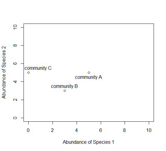
Consider a single axis representing the abundance of a single species. Along this axis, we can plot the communities in which this species appears, based on its abundance within each.

Now consider a second axis of abundance, representing another species. We can now plot each community along the two axes (Species 1 and Species 2).
Now consider a third axis of abundance representing yet another species.
# install.packages("scatterplot3d")
library(scatterplot3d)
d=scatterplot3d(0:10,0:10,0:10,type="n",xlab="Abundance of Species 1",
  ylab="Abundance of Species 2",zlab="Abundance of Species 3"); d
d$points3d(5,5,0); text(d$xyz.convert(5,5,0.5),labels="community A")
d$points3d(3,3,3); text(d$xyz.convert(3,3,3.5),labels="community B")
d$points3d(0,5,5); text(d$xyz.convert(0,5,5.5),labels="community C")

Keep going, and imagine as many axes as there are species in these communities.

The goal of NMDS is to represent the original position of communities in multidimensional space as accurately as possible using a reduced number of dimensions that can be easily plotted and visualized (and to spare your thinker).
How does it work?
NMDS does not use the absolute abundances of species in communities, but rather their rank orders. The use of ranks omits some of the issues associated with using absolute distance (e.g., sensitivity to transformation), and as a result is much more flexible technique that accepts a variety of types of data. (It’s also where the “non-metric” part of the name comes from.)
The NMDS procedure is iterative and takes place over several steps:
- Define the original positions of communities in multidimensional space.
- Specify the number of reduced dimensions (typically 2).
- Construct an initial configuration of the samples in 2-dimensions.
- Regress distances in this initial configuration against the observed (measured) distances.
- Determine the stress, or the disagreement between 2-D configuration and predicted values from the regression. If the 2-D configuration perfectly preserves the original rank orders, then a plot of one against the other must be monotonically increasing. The extent to which the points on the 2-D configuration differ from this monotonically increasing line determines the degree of stress. This relationship is often visualized in what is called a Shepard plot.
- If stress is high, reposition the points in 2 dimensions in the direction of decreasing stress, and repeat until stress is below some threshold.**A good rule of thumb: stress < 0.05 provides an excellent representation in reduced dimensions, < 0.1 is great, < 0.2 is good/ok, and stress < 0.3 provides a poor representation.** To reiterate: high stress is bad, low stress is good!
Additional note: The final configuration may differ depending on the initial configuration (which is often random), and the number of iterations, so it is advisable to run the NMDS multiple times and compare the interpretation from the lowest stress solutions.
To begin, NMDS requires a distance matrix, or a matrix of dissimilarities. Raw Euclidean distances are not ideal for this purpose: they’re sensitive to total abundances, so may treat sites with a similar number of species as more similar, even though the identities of the species are different. They’re also sensitive to species absences, so may treat sites with the same number of absent species as more similar.
Consequently, ecologists use the Bray-Curtis dissimilarity calculation, which has a number of ideal properties:
- It is invariant to changes in units.
- It is unaffected by additions/removals of species that are not present in two communities,
- It is unaffected by the addition of a new community,
- It can recognize differences in total abundances when relative abundances are the same,
Let’s do it in R!
To run the NMDS, we will use the function metaMDS from the vegan package. The function requires only a community-by-species matrix (which we will create randomly).
You should see each iteration of the NMDS until a solution is reached (i.e., stress was minimized after some number of reconfigurations of the points in 2 dimensions). You can increase the number of default iterations using the argument trymax=. which may help alleviate issues of non-convergence. If high stress is your problem, increasing the number of dimensions to k=3 might also help.
example_NMDS=metaMDS(community_matrix,k=2,trymax=100)
You’ll see that metaMDS has automatically applied a square root transformation and calculated the Bray-Curtis distances for our community-by-site matrix.
Let’s examine a Shepard plot, which shows scatter around the regression between the interpoint distances in the final configuration (i.e., the distances between each pair of communities) against their original dissimilarities.
stressplot(example_NMDS)

Large scatter around the line suggests that original dissimilarities are not well preserved in the reduced number of dimensions. Looks pretty good in this case.
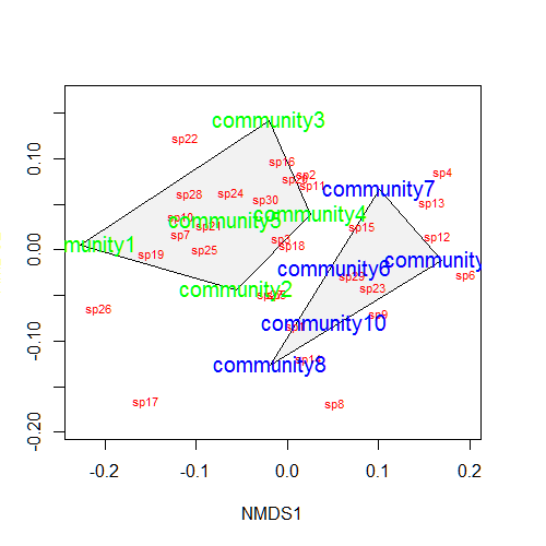
Now we can plot the NMDS. The plot shows us both the communities (“sites”, open circles) and species (red crosses), but we don’t know which circle corresponds to which site, and which species corresponds to which cross.
plot(example_NMDS)

We can use the function ordiplot and orditorp to add text to the plot in place of points to make some sense of this rather non-intuitive mess.
ordiplot(example_NMDS,type="n")
orditorp(example_NMDS,display="species",col="red",air=0.01)
orditorp(example_NMDS,display="sites",cex=1.25,air=0.01)

That’s it! There’s a few more tips and tricks I want to demonstrate.
Let’s suppose that communities 1-5 had some treatment applied, and communities 6-10 a different treatment. We can draw convex hulls connecting the vertices of the points made by these communities on the plot. I find this an intuitive way to understand how communities and species cluster based on treatments.
treat=c(rep("Treatment1",5),rep("Treatment2",5))
ordiplot(example_NMDS,type="n")
ordihull(example_NMDS,groups=treat,draw="polygon",col="grey90",label=F)
orditorp(example_NMDS,display="species",col="red",air=0.01)
orditorp(example_NMDS,display="sites",col=c(rep("green",5),rep("blue",5)),
   air=0.01,cex=1.25)
One can also plot “spider graphs” using the function orderspider, ellipses using the function ordiellipse, or a minimum spanning tree (MST) using ordicluster which connects similar communities (useful to see if treatments are effective in controlling community structure).

You could also color the convex hulls by treatment.
# First, create a vector of color values corresponding of the
# same length as the vector of treatment values
colors=c(rep("red",5),rep("blue",5))
ordiplot(example_NMDS,type="n")
#Plot convex hulls with colors baesd on treatment
for(i in unique(treat)) {
  ordihull(example_NMDS$point[grep(i,treat),],draw="polygon",
   groups=treat[treat==i],col=colors[grep(i,treat)],label=F) }
orditorp(example_NMDS,display="species",col="red",air=0.01)
orditorp(example_NMDS,display="sites",col=c(rep("green",5),
  rep("blue",5)),air=0.01,cex=1.25)
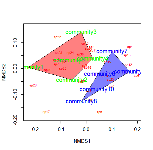
*You may wish to use a less garish color scheme than I
If the treatment is continuous, such as an environmental gradient, then it might be useful to plot contour lines rather than convex hulls. We can simply make up some, say, elevation data for our original community matrix and overlay them onto the NMDS plot using ordisurf:
Which produces the following plot:
 You could even do this for other continuous variables, such as temperature.
________________________
The full example code (annotated, with examples for the last several plots) is available below:
# Non-metric multidimensional scaling (NMDS) is one tool commonly used to
# examine community composition

# Let's lay some conceptual groundwork
# Consider a single axis of abundance representing a single species:
plot(0:10,0:10,type="n",axes=F,xlab="Abundance of Species 1",ylab="")
axis(1)
# We can plot each community on that axis depending on the abundance of
# species 1 within it
points(5,0); text(5.5,0.5,labels="community A")
points(3,0); text(3.2,0.5,labels="community B")
points(0,0); text(0.8,0.5,labels="community C")

# Now consider a second axis of abundance representing a different
# species
# Communities can be plotted along both axes depending on the abundance of
# species within it
plot(0:10,0:10,type="n",xlab="Abundance of Species 1",
     ylab="Abundance of Species 2")
points(5,5); text(5,4.5,labels="community A")
points(3,3); text(3,3.5,labels="community B")
points(0,5); text(0.8,5.5,labels="community C")

# Now consider a THIRD axis of abundance representing yet another species
# (For this we're going to need to load another package)
# install.packages("scatterplot3d")
library(scatterplot3d)
d=scatterplot3d(0:10,0:10,0:10,type="n",xlab="Abundance of Species 1",
                ylab="Abundance of Species 2",
                zlab="Abundance of Species 3"); d
d$points3d(5,5,0); text(d$xyz.convert(5,5,0.5),labels="community A")
d$points3d(3,3,3); text(d$xyz.convert(3,3,3.5),labels="community B")
d$points3d(0,5,5); text(d$xyz.convert(0,5,5.5),labels="community C")

# Now consider as many axes as there are species S (obviously we cannot
# visualize this beyond 3 dimensions)
# Hopefully your head didn't explode

# The goal of NMDS is to represent the original position of communities in
# multidimensional space as accurately as possible using a reduced number
# of dimensions that can be easily plotted and visualized

# NMDS does not use the absolute abundances of species in communities, but
# rather their RANK ORDER!
# The use of ranks omits some of the issues associated with using absolute
# distance (e.g., sensitivity to transformation), and as a result is much
# more flexible technique that accepts a variety of types of data
# (It is also where the "non-metric" part of the name comes from)

# The NMDS procedure is iterative and takes place over several steps:
# (1) Define the original positions of communities in multidimensional
# space
# (2) Specify the number m of reduced dimensions (typically 2)
# (3) Construct an initial configuration of the samples in 2-dimensions
# (4) Regress distances in this initial configuration against the observed
# (measured) distances
# (5) Determine the stress (disagreement between 2-D configuration and
# predicted values from regression)
# If the 2-D configuration perfectly preserves the original rank
# orders, then a plot ofone against the other must be monotonically
# increasing. The extent to which the points on the 2-D configuration
# differ from this monotonically increasing line determines the
# degree of stress (see Shepard plot)
# (6) If stress is high, reposition the points in m dimensions in the
#direction of decreasing stress, and repeat until stress is below
#some threshold

# Generally, stress < 0.05 provides an excellent represention in reduced
# dimensions, < 0.1 is great, < 0.2 is good, and stress > 0.3 provides a
# poor representation

# NOTE: The final configuration may differ depending on the initial
# configuration (which is often random) and the number of iterations, so
# it is advisable to run the NMDS multiple times and compare the
# interpretation from the lowest stress solutions

# To begin, NMDS requires a distance matrix, or a matrix of
# dissimilarities
# Raw Euclidean distances are not ideal for this purpose: they are
# sensitive to totalabundances, so may treat sites with a similar number
# of species as more similar, even though the identities of the species
# are different
# They are also sensitive to species absences, so may treat sites with
# the same number of absent species as more similar

# Consequently, ecologists use the Bray-Curtis dissimilarity calculation,
# which has many ideal properties:
# It is invariant to changes in units
# It is unaffected by additions/removals of species that are not
# present in two communities
# It is unaffected by the addition of a new community
# It can recognize differences in total abudnances when relative
# abundances are the same

# To run the NMDS, we will use the function `metaMDS` from the vegan
# package
#install.packages("vegan")
library(vegan)
# `metaMDS` requires a community-by-species matrix
# Let's create that matrix with some randomly sampled data
set.seed(2)
community_matrix=matrix(sample(1:100,300,replace=T),nrow=10,
                        dimnames=list(paste("community",1:10,sep=""),
                                      paste("sp",1:30,sep="")))

# The function `metaMDS` will take care of most of the distance
# calculations, iterative fitting, etc. We need simply to supply:
example_NMDS=metaMDS(community_matrix, # Our community-by-species matrix
                     k=2) # The number of reduced dimensions
# You should see each iteration of the NMDS until a solution is reached
# (i.e., stress was minimized after some number of reconfigurations of
# the points in 2 dimensions). You can increase the number of default
# iterations using the argument "trymax=##"
example_NMDS=metaMDS(community_matrix,k=2,trymax=100)

# And we can look at the NMDS object
example_NMDS # metaMDS has automatically applied a square root
# transformation and calculated the Bray-Curtis distances for our
# community-by-site matrix
# Let's examine a Shepard plot, which shows scatter around the regression
# between the interpoint distances in the final configuration (distances
# between each pair of communities) against their original dissimilarities
stressplot(example_NMDS)
# Large scatter around the line suggests that original dissimilarities are
# not well preserved in the reduced number of dimensions

#Now we can plot the NMDS
plot(example_NMDS)
# It shows us both the communities ("sites", open circles) and species
# (red crosses), but we  don't know which are which!

# We can use the functions `ordiplot` and `orditorp` to add text to the
# plot in place of points
ordiplot(example_NMDS,type="n")
orditorp(example_NMDS,display="species",col="red",air=0.01)
orditorp(example_NMDS,display="sites",cex=1.25,air=0.01)

# There are some additional functions that might of interest
# Let's suppose that communities 1-5 had some treatment applied, and
# communities 6-10 a different treatment
# We can draw convex hulls connecting the vertices of the points made by
# these communities on the plot
# First, let's create a vector of treatment values:
treat=c(rep("Treatment1",5),rep("Treatment2",5))
ordiplot(example_NMDS,type="n")
ordihull(example_NMDS,groups=treat,draw="polygon",col="grey90",
         label=FALSE)
orditorp(example_NMDS,display="species",col="red",air=0.01)
orditorp(example_NMDS,display="sites",col=c(rep("green",5),rep("blue",5)),
         air=0.01,cex=1.25)
# I find this an intuitive way to understand how communities and species
# cluster based on treatments
# One can also plot ellipses and "spider graphs" using the functions
# `ordiellipse` and `orderspider` which emphasize the centroid of the
# communities in each treatment

# Another alternative is to plot a minimum spanning tree (from the
# function `hclust`), which clusters communities based on their original
# dissimilarities and projects the dendrogram onto the 2-D plot
ordiplot(example_NMDS,type="n")
orditorp(example_NMDS,display="species",col="red",air=0.01)
orditorp(example_NMDS,display="sites",col=c(rep("green",5),rep("blue",5)),
         air=0.01,cex=1.25)
ordicluster(example_NMDS,hclust(vegdist(community_matrix,"bray")))
# Note that clustering is based on Bray-Curtis distances
# This is one method suggested to check the 2-D plot for accuracy

# You could also plot the convex hulls, ellipses, spider plots, etc. colored based on the treatments
# First, create a vector of color values corresponding of the same length as the vector of treatment values
colors=c(rep("red",5),rep("blue",5))
ordiplot(example_NMDS,type="n")
#Plot convex hulls with colors baesd on treatment
for(i in unique(treat)) {
  ordihull(example_NMDS$point[grep(i,treat),],draw="polygon",groups=treat[treat==i],col=colors[grep(i,treat)],label=F) }
orditorp(example_NMDS,display="species",col="red",air=0.01)
orditorp(example_NMDS,display="sites",col=c(rep("green",5),rep("blue",5)),
         air=0.01,cex=1.25)

# If the treatment is a continuous variable, consider mapping contour
# lines onto the plot
# For this example, consider the treatments were applied along an
# elevational gradient
# We can define random elevations for previous example
elevation=runif(10,0.5,1.5)
# And use the function ordisurf to plot contour lines
ordisurf(example_NMDS,elevation,main="",col="forestgreen")
# Finally, we want to display species on plot
orditorp(example_NMDS,display="species",col="grey30",air=0.1,cex=1)

This is awesome! Thanks for going through this in such detail. Including a way to visualize treatments on sites with convex hulls was especially useful.
This is so cool! Thank you very much for this tutorial.
In the NMDS plot am trying to plot the actual name of each site instead of its number. Do you have any hint for how to do it?
Thanks
Linda
Hi Linda, thanks for your comment! Changing the argument “display=” for the `ordiplot` function to “sites” instead of “species” should solve your problem! Let me know if not…
Hi Jon,
Thanks again for this great site. I am preparing my NMDS figure for publication and I was trying to figure out how to plot only the points. It came to your website and I saw that Imp had already asked the same question.
Great!
Hi, Linda, have you know how to add the name of site to the nmds plots? I am trying to add the name to plots, but it is not working.
Hey there.
Absolute hero for putting this together!! I’m jumping in the deep end and have been reading and learning lots figuring out R, Bray Curtis and nMDS. I finally managed to get a plot I am looking for. First off, I may be off completely in what I am trying to do also so hopefully that’s not the case. The background reading I have done and other papers I have looked at seem to be pointing me in the direction I’m going.
I have am looking at diet amongst 3 sites. I have imported my dataset into R and converted into a data matrix. In your example the first column is row.names. I do not have this and when using metaMDS I get the final lines saying:
Warning message:
In distfun(comm, method = distance, …) :
you have empty rows: their dissimilarities may be meaningless in method “bray”
This then prevents me from getting the final NMDS plot. If I add a column to my data set with each sites name (in my case each animal sampled) however and convert this to a data matrix. It appears that problem is solved and I get a “good looking” plot. However when looking at the plot and the labels using your methods above I see the plot has included this newly introduced column (each of my samples) into the data set used for the plot. Looking at the data matrix produced this new column simply has values starting from 1 going up each time for each added sample.
Is there a way to get around this?
Or will this actually not be affecting the final outcome? I have a stress of 0.26 with this. Does that stress mean that the plot is not so useful ultimately in 2D?
I am basically just looking for a good way to graphically represent that at different sites there is different (or the same) prey composition. All roads seem to be leading to Bray Curtis then nMDS. Figuring it out in R seems to be the trickier part.
Any assistance would be greatly appreciated.
Cheers
Jono
Hi Jono, thanks for checking out my tutorial! Its difficult to tell what’s going on without having a sense for your data matrix. Is it % composition, number of individuals, or biomass of diet species? Do you have missing cells? I’m kind of curious where the blank rows error is coming from…it may be junk leftover from Microsoft Excel. I find that happens from time to time. Try selecting rows and columns around your data in Excel and delete them.
As for the sample names, you can set them as the row.names for the matrix by providing them as a vector in the following line of code: rownames(data.frame)=c(“Animal 1″,”Animal 2”) and so on. That should prevent them from being incorporating into the distance calculations.
It’s probably not worth trying to interpret the stress from an NMDS that includes animal ID as a “species.” But generally, anything > 0.2 is considered to be poorly represented in 2-dimensional space.
You should also consider whether this problem is appropriate for NMDS. Are you interested in comparing diet composition within a site? Or diets across sites? What is your replicate? If you have multiple animals per site, you may want to consider “site” as your treatment and using ordihull or ordispider to connect individuals within each of your sites after having plotted the results from the NMDS.
Hi there. Thank you so much for assisting me.
I am using number of individuals at the moment.
I cannot find any missing cells. I have tried resaving it from excel a few times, both as .csv and .txt files. Neither seem to be the solution.
Will try out the sample names change.
I feel the problem is appropriate for NMDS. All the reading I have done for comparing diet amongst more than 2 sites seems to point in this direction. I am looking to compare diet across sites. At the moment I have 122 rows and 26 columns. Each row is one animal and each column is a species, the data in the cell is the number of individuals. (This is the set up I have been using for plotting species accumulation curves and it seems to work). This matrix represents all animals sampled at 3 sites. Approximately 40 per site.
My first column starts straight away with a species rather an initial column that would be titled samples. When I put in the samples column then the plot seems to be work but again the issue mentioned above is there.
Any suggestions greatly appreciated.
Kind Regards
Jono
Hi! Have to admit embarrassingly that there was a row with all zeros in it. Problem seems to be solved 🙂
Really appreciate the help!
No worries! Its the simple things in R…
Hi Jon
That function ordispider is fantastic. Your suggestion of connecting individuals with ordispider and considering site as a treatment was great. It really brings across what I was looking for in a very user friendly manner!
I am wondering now though, is there a function that you are aware of that does the same as ordispider, giving you the centroid of your treatment, but that does not leave you with all the “arms” sticking out? I have been fiddling with the other ordination graphics (http://cc.oulu.fi/~jarioksa/softhelp/vegan/html/ordihull.html) but can’t seem to figure a solution yet.
Thanks so much
Jono
Hi Jono, I’ve been looking into this for a few days and can’t find an easy way to do it. I would suggest using a function to calculated weighted centroids and using points to plot them. If I figure it out in the interim, I’ll reply here!
This is the best and most helpful tutorial I found so far! Thanks especially for the background theory! It would be great, if you could change the right margine of the text, so that all of the text is visible :-)! Thanks again!
Hi Sandra,
Yeah, the text box has always bothered me, but I like the highlighting pretty-r.org offers. It’s an automated service and I’m afraid I don’t have the HTML knowledge to fix it. If anyone who is a better web programmer than I can chime it, that would be sweet.
Jon
Hi and thanks for the quick reply. I don´t know anything about the pretty-r.org offers, but if the size of the box is adjusted to the margins of the WordPress blog, this link http://wordpress.org/support/topic/changing-margins might be helpful. You could also split the text in more shorter lines, so that your readers don´t have to scroll so much. But anyway, I am really grateful despite all the scrolling!
Hi Jon,
Thank you so much for this script, it really helped me understand and then use it to analyze my own dataset.
Similar to your code, I have applied treatments to plots, however instead of having coloured numbers, I was wondering if you could tell me how to replace these with plotting characteres..?
According to vegan FAQ: The default ordination plot function is intended for fast plotting and it is not very configurable. To use different plotting symbols, you should first create and empty ordination plot with plot(…, type=”n”), and then add points or text to the created empty frame (here … means other arguments you want to give to your plot command). The points and text commands are fully configurable, and allow different plotting symbols and characters.
I can’t figure out though how to set this up. Do you know how?
Hi Imp,
Try this (using example from above):
treat=c(rep(“Treatment1”,5),rep(“Treatment2″,5))
ordiplot(example_NMDS,type=”n”)
ordihull(example_NMDS,groups=treat,draw=”polygon”,col=”grey90″,label=FALSE)
orditorp(example_NMDS,display=”species”,col=”red”,air=0.01)
points(example_NMDS$points,col=c(rep(“green”,5),rep(“blue”,5)),pch=rep(c(16,18),each=5),cex=2)
Fiddle with pch to change the type of symbols!
Cheers, Jon
Hi, this is a great explanation of NMDS thanks for posting.
Maybe this is not the forum for this question, but I wonder if you have a preferred transformation to use with semi-quantitative data (class cover data expressed in a 0-5 scale). I was thinking to use the Hellinger transformation but I am not entirely sure if this is the best one.
Cheers,
Cristina
Hi Cristina, Thanks for the comment. I’m afraid I can’t be much help but you should check out Clarke and Warwick’s PRIMER manual, if you have access (or shoot me an e-mail). They discuss appropriate transformations for these types of analysis. Cheers, Jon
Hi! This is awesome! Do you know if there’s a way to categorize the species so that different, say functional guilds, are all colored one color?
Great tutorial!! I’m a newbie in R, but this helped me a lot, specially all the background theory for understanding the analysis. Keep on doing this awesome job! Since now im a follower of this blog!
Hi,
I agree with the rest of the comments. This is a great tutorial. Thanks for it.
Is it possible to make a NMDS with different size samples from two different treatments. I have some abundace data from the same treatment with a shorter number of total species than other one, this one has only two samples. So, if it is not possible to combien different size samples. Is it possible to run NMDS with only two samples?
Thank you so much.
Hi,
This is for the first time I am going to use R. I would like to go for NMDS analysis for my data set. I have used the prescribed code given here as per my data, but I am unable to run it. I am having a database of 21 row ( community) and 819 column (species). Kindly suggest me the code for input rows and column in NMDS analysis for my data. I would like to know that, is there any constraint to use my data set in NMDS?
Thanks
Swapna
Hi Swapna, Sorry to hear its not working out for you. Your data is formatted properly. Please send me an email with your error message and perhaps we can work through it. Cheers, Jon
Ya sure.
Thanks a lot to give us time for looking towards different problem and also very quick response from you…!!!!!!
Best regards
Swapna
Hello Jon
Can u plz tell me the minimun no of row and column to be required to run NMDS?
The number of observations must be : n > 2*k + 1, where k is the number of dimensions. So the fewest number of rows for k=2 is 5 observations.
Hi Jon, Thank you very much.
Jon, This is most excellent and very helpful that you posted my question with the elevation stuff. It’s helpful because I’m about to present this to my wetlands ecology class and now I can just point them to your post rather than explaining the steps in class! Thanks again for your help!!
Outstanding tutorial, thank you.
Hi there-
thanks for the tutorial! Do you happen to have any advice where to obtain the data in the output of how much each axis accounts for the abundances of OTUs? It seems like these plots often have percentages on each axis, which from my understanding means that the x axis accounts for x amount of abundance, the y axis, y amount of abundance and z axis…
Am I making sense here? Any advice? I have a plot with r^2=0.97 and stress of 0.119, so it seems like a good fit.
Thanks!
Rachel
Doing my first ever NMDS on community data taken at different distances from seagrass beds, this tutorial was extremely helpful.
I dont’ understand how to use the command
for(i in unique(group)) {ordihull(NMDS$point[grep(i,group),],draw=”polygon”,groups=group[group==i],col=colors[grep(i,group)],label=F)}
I received:
Erreur dans chull(X) :
NA/NaN/Inf dans un appel à une fonction externe (argument 2)
In my case treat =group, and i created a good vector of color values corresponding of the same length as the vector of group values
Can anyone help me ?
It sounds like a problem with the raw data. If you e-mail directly and explain your dataset, I can probably help you better.
Jon,
Thanks for posting this. It cleared up a bunch of concepts for me. One issue I’m running in to is that I have sites that may have no species. My matrix is set up with sites (5) in col 1 and species in col 2 (range from 34 to 66 depending on site. I’m trying to use nMDS to compare the composition between sites and obviously not all animals are at all sites. I am using the species identifiers in the data set rather than abundance therefore I am not using any 0s to fill in blanks. I keep getting the following errors with no output:
Warning in Ops.factor(left, right) : 0, wascores) && any(comm < 0)) { :
missing value where TRUE/FALSE needed
I believe this might have something to do with the blanks but it seems like this should be doable.
Data looks like this
19R Op_un Br_1 Op_5 Op_6 T_1
21R Op_un Ch_1 C_6 Cr_5 Op_5
23R Op_un Ch_1 Ho_1 P_9
24R Op_5 Op_un Op_3 Op_1
27R Op_un C_7 Op_16 Op_8
29R C_7 Ch_1 Op_1 Op_3 C_6
Any help would be appreciated.
Hi David, The issue I think is that you have non-numeric characters as values in your community-by-species matrix. Simply replace presences with 1 and absences as 0 (which is essentially relaying the same information). It should run just fine then. Cheers, Jon
Hi Jon,
This is a great tutorial; very easy to understand and straightforward. The detail and background information were particularly useful. I loved the explanation of each dimension.
I also had a quick question about coloring/representing communities based on treatments. My sites/communities aren’t listed in group-order. Instead they’re in alphabetical order. Is there another way to specify treatments other than:
> treat=c(rep(“Treatment1”,5),rep(“Treatment2”,5))
I have another data.frame that has each community in column 1 with the associated treatment in column 2.
Thanks,
Kara
Hi Kara, You could relevel the treatment in your data.frame, e.g.: factor(data,levels=c(“2″,”1”,etc)) or you could modify the treat vector to reflect the actual order of your groups. Cheers, Jon
Hi Jon,
I have enjoyed your tutorial it is a really nice explanation. I was wondering though if you know how to get the amount of variation explained by each axis? McCune and Grace says you should be able to get this based on the r2 from something like the stressplot – but I don’t know how to do that for each axis. Any suggestions are greatly appreciated!
Cara
Hi Cara, This thread should help answer your question: https://r-forge.r-project.org/forum/forum.php?thread_id=713&forum_id=194. It cuts out the original question but I think you should be able to follow. If you still have questions, shoot me an email. Cheers, Jon
Thanks Jon! I also wanted to add something helpful that I found. You can make a matrix from one column at a time of the MDS scores using drop=FALSE. I have my MDS saved as NMDS2 so first save the scores as a variable, then save the euclidean distance for each axis as:
scores.MDS<- scores(NMDS2)
axis1<-dist(scores.MDS[, 1, drop=FALSE], method="euclidean")
Then you can find the r2 for each axis with a mantel test between axis1 and the dissimilarity matrix from the MDS (the dissimilarity matrix can be called with metaMDSredist(NMDS2) ).
Finding the "drop=FALSE" was key for me so I wanted to share it in case it is helpful for others. Thanks again for your helpful blog and quick response!
Hi Jon,
thank you for a great tutorial. I have previously used PCOrd for NMDS-analyses (yeah, embarrassing), but I have now shifted to R, and this tutorial was very helpful. I have one question remaining, though: When presenting an NMDS plot in a publication, I want the positions of my samples in the plot represented as dots – with the names of each sample locality written on top or besides the dot. This is default in PCOrd, and in my opinion a very clear way to present data. When I do NMDS in R (either using the metaMDS or the monoMDS-function), it appears to me that I can only get either the sample names OR the points represented in the plot (just as you get above). How do I do get both? If this is unclear, I would be very happy to send you some data and some of my associated scripting and/or a picture of a plot as I want it. Best regards, Christoffer
Hi Christoffer, Actually a very easy fix! Open a new blank plot, and then add points() and text() corresponding to your communities. E.g.,
ordiplot(example_NMDS,type=”n”)
points(example_NMDS,display=”sites”,pch=16,col=”red”)
text(example_NMDS,display=”sites”,pos=3)
Shoot me an email if you have any further questions! Cheers, Jon
Works beautifully. Artfully, even! Now I almost feel sad that I have to eventually relinquish copyright to this piece of modern art to a journal editor..Almost. Were i a German baroque composer, I would have found it fit singing “Jauchzet, frohlocket, auf preiset die Tage”! Were I a German baroque composer having emigrated to the UK, I might even have chanted “I know that my redeemer liveth”!
However as a mere aspiring scientist eager to show that he has done the compulsory reading of “How to write consistently boring scientific literature” (http://onlinelibrary.wiley.com/doi/10.1111/j.0030-1299.2007.15674.x/pdf), I will let it suffice for the time being to say THANK YOU! 🙂 – learning more about R from a biologist who obviously manages to be well-versed in this this fascinating language without simultaneously losing track of his field science is inspiring beyond the simple solution to my specific problem here! Best regards, Christoffer
P.S. While I still have you on the line, may I ask you a purely graphical question about how to improve my plot visually by setting shorter limits on the X-axis? When I run the ordiplot command and try to restrict the axis limits, xlim simply will not allow me to go lower than -3.5,3.5 (all my points fall in between -2,2, and I end up with a lot of empty space to the right and left). Ylim works fine.
ordiplot(my_NMDS,main=”my_NMDS-plot”, type=’n’, cex=1.25, xlim=c(-2,2), ylim=c(-2.25,1.25))
Is this because of something hardcoded? Cheers, Christoffer
Hmm, that is strange. I cannot reproduce using the example above, e.g.,
ordiplot(example_NMDS,type=”n”,xlim=c(-4,4))
points(example_NMDS,display=”sites”,pch=16,col=”red”)
text(example_NMDS,display=”sites”,pos=3)
Works just fine (albeit difficult to read). When in doubt, kill R and re-run from scratch. Sometimes graphical parameters get screwed up somewhere along the way and throw plotting errors down the line.
My other suggestion is to use ggplot2, which produces far nicer plots than base R. For example:
library(ggplot2)
(p=ggplot(data=cbind(comm=rownames(example_NMDS$points),as.data.frame(example_NMDS$points)),
aes(x=MDS1,y=MDS2))+
geom_point(size=4,col=”red”)+
geom_text(aes(label=comm),vjust=1.5))
p+coord_cartesian(xlim=c(-0.28,0.22)) #Fits everything in the plotting area with no wasted space
Cheers! Jon
PS thanks for passing along that pub — hilarious!
Hi Jon, just piling on to the beautiful ggplot: What would be the easiest way if I would like to colour my points by group identity, and subsequently add a “hull” using the ordihull function (in ggplot2)?
I have 102 samples grouped into 4 patient types with individual names such as “acute1, acute2, …. control1, control2…., mycop1, mycop2….., clam1, clam2….” which I would like to order into four groups “acute”, “control”, “mycop” and “clam”, represented by points coloured by patient type (with legend) and surrounded by a ordihull.
I have tried to assign a simple colour vector of four and group the samples into four objects as patient types and add that to a modified version of your above code – I can make it work in base plots, but it does not seem to work in ggplot. I have got used to you being able to produce an easy solution with a handwave……… 🙂 My highest regards, Christoffer
Hello Christoffer, Ha! Alas, what appears to be the wave of a hand is in reality many years of grueling headbanging and hair-pulling! Hang in there.
This is actually quite easy to do with ggplot2. Building on my previous response using the example_NMDS output:
# Use function chull() to derive hull vertices
hulls.df = do.call(rbind, lapply(unique(treat), function(i) {
data = example_NMDS$points[which(treat == i), ]
data.frame(
treat = i,
data[chull(data[, 1], data[, 2]),],
row.names = NULL
)
} ) )
ggplot(
# Create data object including treatment as a column
data = cbind(comm = rownames(example_NMDS$points), treat = treat, as.data.frame(example_NMDS$points)),
aes(x = MDS1, y = MDS2))+
# Create polygon from hull dataframe
geom_polygon(data = hulls.df, aes(x = MDS1, y = MDS2, group = treat, fill = treat), alpha = 0.5, lwd = 0.8) +
# Use aesthetics to color points by treatment
geom_point(aes(col = treat), size = 4) +
geom_text(aes(label = comm), vjust = 1.5)
That should produce a pretty ggplot equivalent of the base plot produced using ordihull(). Cheers! Jon
That works, once again, beautifully. One last thing (and then I promise to shut up for a while(though likely not forever – this is just too amazingly useful a way to learn!) 🙂 ) :
If I then want to add the species as text/points, how do I create the necessary objects (equivalent to species as text/points in the base plots) in ggplot2? I tried to create a second data object with cbind and the colnames, it does not work with aes (because of the length).
(And yes, I realise that the plot gets woefully crowded if I add all of these things at once, I am just in the process of trying different things out to see what will tell the tidiest and most intuitively understandable story). Cheers, Christoffer
No worries! Simply access the species points stored in the NMDS object: example_NMDS$species, and use geom_point() and geom_text() to plot.
E.g., add the following lines to the code above:
geom_point(data = cbind(sp = rownames(example_NMDS$species), as.data.frame(example_NMDS$species)),
aes(x = MDS1, y = MDS2), size = 2) +
geom_text(data = cbind(sp = rownames(example_NMDS$species), as.data.frame(example_NMDS$species)),
aes(x = MDS1, y = MDS2, label = sp), col = “red”, vjust = 1.5)
Cheers! Jon
Hi Jon,
your chull vertices derivation worked fine for me on the specific dataset I asked you about.
However, when I try to apply it on other datasets with 7 and 3 “patient” groups (defined by vector I create), I get an error message saying
# Use function chull() to derive hull vertices
hulls.df = do.call(rbind, lapply(unique(treat), function(i) {
data = My_NMDS$points[which(treat == i), ]
data.frame(
treat = i,
data[chull(data[, 1], data[, 2]),],
row.names = NULL
)
} ) )
Error in data [,2] : incorrect number of dimensions
What needs to be corrected here? Best regards,
Christoffer
Its possible that the groups have too few points to construct the vertices (e.g., 1 or 2 points) using chull(). Feel free to drop me an email and we can hash out the specifics of your data in a less public venue. Cheers, Jon
Hi Jon
Just a query regarding stress thresholds. You state in on this page:
“**A good rule of thumb: stress > 0.05 provides an excellent representation in reduced dimensions, > 0.1 is great, >0.2 is good/ok, and stress > 0.3 provides a poor representation.**”
Do you have a reference for that? Both Kruskal, (1964) McCune and Grace (2002) propose that an NMDS with stress 10-15 (presumably 0.1 to 0.15) will produce a “usable” ordination. I am struggling to attain lower stress than 15 (0.15) using three dimensions. A two dim solution, which I would prefer to work with, returns something like 25 (0.25). Can you clarify how you came about the above thresholds for final stress? (N/B: this is for my PhD thesis, so I really need a reference if you can provide one!).
In addition, I have been having some problem with down weighting of rare taxa…in that it doesn’t seem to be working. My data is percentage abundance of microfossils, where abundances are variable and some taxa are absent in part of the sequence. I used the function:
downweight(mydata, fraction = 5)
It appeared to do nothing, and certainly did not minimise the impact of rare taxa. Can you suggest why this might be?
Many thanks
James
Kruskal, J.B., 1964. Nonmetric multidimensional scaling: a numerical method.
Psychometrika 29, 115-129.
McCune, B., Grace, J.B., 2002. Analysis of Ecological Communities. MjM Software
Design, Gleneden Beach, Oregon.
Hi James,
The citation comes from the user manual for PRIMER by Clarke & Warwick. Full ref is:
Clarke, K. R., and R. M. Warwick. 1994. Change in marine communities: an approach to statistical analysis and interpretation. Second Edition. PRIMER-E Ltd.
Its a bit difficult to find digitally, but there are ways (*ahem* email *ahem*). If you are concerned about the high stress, you can run the NMDS multiple times and see whether that really changes your groupings. If so, you may consider reporting the 3-dimensional results.
As for down-weighting rare observations, I’m not sure, to be honest. I would be inclined to remove them altogether if you think they are highly influential but do not yield any interesting biological insights because of their rarity. If you want to try and work through together shoot me an email.
Cheers, Jon
Hi Jon,
Great tutorial..!
I just started exploring NMDS in R. I have a very basic question. What should the data look like? Right now I have plots and species in rows and columns respectively with species coverage as the data. How should I include environmental information (vegetation type, disturbance intensity, aspect etc.) in the analysis?
Thanks,
Niyati
Hi Niyati, You can bring that information back in afterwards by extracting the points from the NMDS object and binding it back with the environmental data. Shoot me an email if you are having trouble. Cheers, Jon
Hello Jon – I’m having a heck of a time with a data set that has a lot of zeros in it. I’ve tried adding a column of dummy species, but I still get the following error:
> example_NMDS=metaMDS(community_matrix,k=2)
Error in if (any(autotransform, noshare > 0, wascores) && any(comm < 0)) { :
missing value where TRUE/FALSE needed
In addition: Warning message:
In Ops.factor(left, right) : ' community_matrix
X sp1 sp2 sp3 sp4 sp5 sp6 sp7 sp8
1 community1 11 0 0 0 0 0 0 1
2 community2 6 0 0 0 0 0 0 1
3 community3 4 0 0 0 0 0 0 1
4 community4 15 2 0 0 0 0 0 1
5 community5 8 0 0 0 0 0 0 1
6 community6 3 0 1 0 0 0 0 1
7 community7 4 0 0 0 0 0 0 1
8 community8 24 0 0 0 0 0 0 1
9 community9 23 0 1 0 0 0 0 1
10 community10 11 0 0 0 0 0 0 1
Any ideas? I appreciate all your help on this (and the tutorial is great, thanks!).
Hi Cecilia, It’s difficult to tell what the problem is (whether with the dissimilarity matrix or the fact that some species do not appear in any samples). Shoot me an email and we can try and figure it out. Cheers, Jon
Hi Jon,
Great tutorial, but I have a problem getting the plot out. I’m using presence-absence data so I used 1s and 0s, but for other environmental variables such as “distance from nearest old growth”, “forest age” etc do I lump it together with my species data? When I did I got a plot with the dimension 1 and 2 axes labelled correctly, but the plots were all wrong.
I tried ordiplot but got this message instead:
Warning message:
In ordiplot(data, type = “n”) : Species scores not available
Do help, thanks so much!
Hi Kelly, You need to only run the site-by-species columns through metaMDS(), then bind the environmental data back with the NMDS$points, then plot. If that’s confusing drop me a line and we can work it out. Cheers, Jon
Hi,
I can’t seem to run MetaMDS, I tried versions 3.1.2 and 3.1.3 and R.studio but to no avail. Which version works?
“package ‘MetaMDS’ is not available (as a binary package for R version 3.1.3)”
metaMDS() is a function within the ‘vegan’ package. install.packages(“vegan”); library(vegan); ?metaMDS
haha I know about ‘vegan’ and have already installed and and ran the ‘vegan’ package but still there was no metaMDS nor monoMDS nor isoMDS. I also preinstalled and ran the ‘MASS’ package, yet none of them worked. Any idea why? Thanks so much for the prompt replies!
Regards,
Kelly
Hi Kelly, If you’re still having issues drop me a line and maybe we can resolve this over email. Cheers, Jon
Hi Jon,
excellent script!
I have a community matrix with bird species (columns) and sample sites (rows). Sample sites are grouped into different habitats. I remember from a publication that it is beneficial to remove rare species from the data set (in addition to removing sample sites/rows with zero entries for Bray-Curtis matrix calculation). After removing species with only 1 occurrence across all habitats and sites I still find outliers when plotting the ordination diagrams. These outliers result in very small stress values e.g. 0.001 with the stress plot flat-lined and r^2 value of 1. When I removed additional outliers the stress values and plot started looking more decent.
How do I decide to remove outliers (after inspecting the NMDS plot) and when should I stop removing these species and/or sample sites?
Hi Rion, I’m afraid there is no hard and fast criterion for removing samples, but you are on the right track. I ran across this recently when I had an outlier comprised of 2 individuals of one exceedingly rare species. I rationalized that this sample was not going to tell me much about my true goals (differentiating among communities between seasons) and in fact obscured that trend by making all the other points appear closer together. Why did this particular sample have 2 individuals of this rare species? Luck? An undergraduate intern who was not familiar with taxonomy and misidentified? Who knows. Ultimately I felt it was better to remove the point and improve the 2-d representation. I suspect you will feel the same 😉 Cheers, Jon
Thanks Jon,
I did remove that species (even though it had >1 occurrences in the data set) to improve the 2D representation and the change to the plot was from a max NMDS1 coordinate of near +700 to +5. Amazing and a real anomaly if you look at the matrix as well.
Hi Jon
Thank you so much for this tutorial, I am extremely appreciative! I am new to R and doing some NMDS on 16S sequencing data (OTUs in columns, subjects in rows) looking at stool samples. I followed your tutorial to the tee and it looks great, but it does look crowded, and I was wondering if I could get resolution in plotting the curves in 3-D. I tried experimenting with scatterplot3D, but it gets messy. I have my NMDS axes in 3 dimensions but cannot seem to generate the plot above in 3-D.
Also, I know this may have been addressed previously, but my 25 subjects are not in order, in case I want to connect those subjects that were cured and those that were relapsed. Is there a quick way to draw these hulls or connectors between subjects that are not in order? I hope I am making sense
Thank you again
Respectfully
Vijay
Hi Jon
I guess to elaborate on the ordering, to use your nice example, how would you do the code where say, community 1, 5, 6, 9, 10 were one treatment, and the other treatment was community 2,3,4,7,8.
That is essentially what I am trying to do, except I have 25 subjects, each and subjects 101, 102, 104, etc etc are cured, and subjects 114, 117, 120, etc etc, are relapsed.
respectfully
Vijay
Vijay, you will need to create a vector of “cured” vs “relapsed” that corresponds exactly with the order in which the subjects appear in your data frame. If the subjects are scored as numeric, you can use ifelse() to create this vector and bind it back to your data frame. E.g., :
# Data frame is called ‘df’
df$treatment = ifelse(df$subject < 114, "cured", "relapsed")
IF they are not numeric its a bit trickier as you will have to more than likely type them out by hand. This can be made easier by perhaps converting to numeric and ordering your subject IDs. Drop me a line if you need help. Cheers, Jon
Hi Vijay, I don’t recommend plotting things in 3-dimensions as I find them all but impossible to interpret. As an alternative, you could also omit some points for clarity (providing the full figure as a supplement), or do variable shading and/or labeling on the points. Figures are sometimes an art form and it may take some fiddling to arrive at the best compromise between your data and your story. Email me if you have any questions. Cheers, Jon
Hi Jon. Brilliant tutorial. It helped me a great deal understand nMDS. Unfortunately when I tried it with my data, I received a warning message that there may be insufficient data, and that stress is (nearly) zero. My data matrix has 4 rows (“communities”) and 20 columns (“species”). That would seem to be to be a reasonable size for a dataset–but I’m a novice. There are however, a number of zeros in the matrix, and I’m wondering if that’s the problem. Do you have any suggestions? Thanks again for the great tutorial.
Hi John, Thanks for the kind words. With respect to your error, I suspect it may be generated by the amount of zeros as well. metaMDS() takes arguments in the form of a distance matrix as well. I recommend investigating some of the distances that allow for lots of zeros, as opposed to the default distance metric (Bray-Curtis). I’m afraid I don’t have a tremendous amount of experience with these, but you may want to check out the PRIMER guide (if you can get a copy) or the Legendre & Legendre Numerical Ecology book for a comparison of different metrics. If you are still having trouble, shoot me an email and perhaps we can work through it together. Cheers, Jon
Hi Jon, Thank you very much. I’ll do some more digging around and may take you up on your offer. Thanks again, John
Thanks for a great tutorial! I used it to show differences in species composition at three locations, which I got done in only a couple of hours, in no small part thanks to you. But I also want to offer the journal a black and white version and would like to replace the coloured numbers with plotting characters. I have played around a fair bit – I just can’t get it to work.
orditorp(data_nMDS,display=”sites”,pch=c(rep(“+”,10),rep(“º”,10),rep(“@”)),air=0.01,cex=1.25)
It still shows numbers, only now all in black. Have you got an idea how I could get this done, please? Much obliged!
Hi Annett, I recommend ggplot2 for addressing this. Its far easier and more intuitive to use than the vegan plotting functions. You can find further instructions in this comment: https://jonlefcheck.net/2012/10/24/nmds-tutorial-in-r/comment-page-1/#comment-3149, and the ones below it. You want to change the shapes aesthetic in geom_point(), e.g., ggplot(example_NMDS$points, aes(x = MDS1, y = MDS2)) + geom_point(aes(shape = location)). Cheers, Jon
Hi Jon,
Thanks for really helpful tutorial. In the ordination of my data, it looks as if there are groupings of samples with different species composition. Do you know if its appropriate to use the NMDS points to cluster the samples into groups?
Hi Shaun, I recommend something like k-means clustering to identify natural groupings in the data. The function ?pamk in the fpc package is a good place to start if you have no a priori expectations for groupings. Let me know if you run into any problems. Cheers, Jon
This is helpful tutorial, and thank you for replying to comments nearly 2 yrs after the original post!
I am trying to group the species, rather than site-which you referenced as treatment, by group (native vs exotic) and am having difficulty doing so. I have columns 1:36 as group 1, and columns 37:100 as group 2. How would you suggest I code this to display these species names diffferently (by color or shape) on an ordination plot.
Hi David, My pleasure. In ordihull() supply a vector of length 100 where each entry denotes group 1 or 2 to the argument groups = . E.g.,
groups = c(rep("group1", 36), rep("group2", 64))ordihull(example_NMDS, groups = groups, draw = "polygon")
orditorp(example_NMDS, display = "species")
You may need to fiddle with that to fit your specific needs. If you need more help drop me an email. Cheers, Jon
Hi Jon,
Shelby showed me your blog and I think it is great, but I was wondering if you could help me with some of the aesthetics. I have 3 legends but I can’t seem to get them all to show and I am having trouble changing the symbols. Do you think you could help? I have the code and text file. Would you mind taking a look. I spent the whole day trying to figure this out haha.
Thanks,
Danielle
Hi Danielle, Shoot me an email and we can work it out! Cheers, Jon
Hi Jon,
I have a problem : i put my data
metaMDS(donnees2,k=2,trymax=10)
It works but the NMDS is in monoMDS and i want in isoMDS because when i do the plot it’s written :
> stressplot(donnees2)
Error in stressplot.default(donnees2) :
can be used only with objects that are compatible with MASS::isoMDS results
So i have just tried in plot but :
> plot(donnees2)
Error in plot.new() : figure margins too large
Sorry if it’s not very clear but thank you for your help.
Hi Corentin, I’m afraid I don’t quite know what’s going on. It sounds like there is an issue with the initial NMDS using metaMDS(). If you examine that object, does it return any errors? Cheers, Jon
Do you think my probleme come from directly my data on excel ?
And is it possible to transform monoMDS in isoMDS to get the stressplot ?
Hi Corentin, I’m afraid this question is better served on the R listserv: https://stat.ethz.ch/mailman/listinfo/r-sig-ecology. Cheers, Jon
Hi there,
This looks great, perfect for a project i’m working on at the moment but i’m very new to R and so I’m slightly terrified. The project i’m working on is looking at differences in insect species assemblages in palm oil and forest patches. I have six transect that run from 300m in the forest to 300m in the palm oil plantation. The transects are split between two forest patches with the transect in each. Each transect has 6 insect trapping station on it at different distances from the forest- plantation ecotone. So, in total we have 18 trapping station in forest and 18 trapping station in palm oil. I want to look at the difference in assemblage between forest and palm oil but also potential the difference in assemblage of communities as you move further from the forest into the palm oil so we can establish if forest acts as a source habitat.
Do you think this is possible and please could you advise me on the best way to lay my data out to analyse in this way. Thank you!
Hi Samantha, Sounds feasible but why don’t you send me an email and we can work out the specifics. Cheers, Jon
Hi Jon,
Just wanted to say thank you so much for this tutorial! It’s one of the best R tutorials I’ve seen and has really helped me.
Sally
Hi Jon,
Thanks so much for the amazing tutorial. When reporting the R squared value for the stressplot is it better to give the non-metric or the linear fit value?
Elie
Hi Elie, Sufficient to report only the stress of the final configuration. Cheers, Jon
hello, thank you very much for this tutorial….I have followed your tutorial step by step to run a NMDS on my dataset of octopus landings for 14 differents harbours during 300 months, obtaining a interesntig results! However, my thesis advisor is asking me why I have choosed the bray and curtis dissimilarity matrix, when it is a way easier to interpret the results using bray-curtis simmilarity. However, I guess thta it is the same matrix, just the similarity or disimilarity is the way to think about the matrix, I mean, data arrange togheter it is more similar in the dis-similarity matrix, or vice versa…it is correct what Im saying? or there is a chance to use a SIMILARITY Bray and Curtis Matrix?
Certainly. You seem to have the right idea. The NMDS uses rank orders derived from any kind of (dis)similarity matrix. So its six in one hand, one half dozen in the other — the choice of (dis)similarity matrix should only reflect the biological assumptions that you believe are driving differences or similarities among communities. Hope I answered your question! If you have more questions, send me an email and we can work it out. Cheers, Jon
Dear Mr Jon Lefcheck
Please may I ask you a question about running NMDS with R on my data?
Hi Jon,
Wonderful tutorial—extremely helpful and the first time I’ve been able to fully wrap my head around NMDS. I have two questions for you, but first a short background to make the questions more clear:
I have zooplankton community data from a number of collections across several months, and I’m trying to relate these to the presence and abundance of a planktivore. So, for each collection date (i.e. ‘site’) I have density data for 26 different zooplankton groups (i.e. ‘species’).
So, I’ve run metaMDS on these data and it seems to work great. Now, I wanted to see if I could include my planktivore abundance in the same way that you had elevation as a continuous variable plotted as a contour. This worked, but I’m not sure how to interpret the output. My planktivore abundance metric ranges from 0-6 (or a different metric that ranges from 0-42), but when I plot the contours for either metric, the contour intervals are minute—e.g. ranging from 2.49 to 2.515 at intervals of 0.005 across all ordinated points. I noticed that in your elevation example the contour intervals are also extremely small, despite runif(10, 0.5, 1.5) giving you a range of 0.5 to 1.5. With this in mind, can you please explain how to interpret the contour plots? It doesn’t seem as if there’s much change at all in the continuous variable in response to the MDS axes.
Second, If I just plot my data along each MDS axis and see where the higher planktivore abundances exist in relation to the zooplankton community structure, it seems that the number of planktivores clearly increases as MDS1 increases. That’s great news, but alone it doesn’t tell me much about what exactly, if anything, the planktivores are responding to. Is it possible to determine which species is (or are) contributing most to the ordination along a given axis?
Many thanks in advance for your assistance! Again, great tutorial.
Cheers,
Josh
Hi Josh, I believe the contours are the expected change in abundance as you move from one to the next, so the effects are additive and not absolute. I would need to look into it more. With respect to species you may find this post illuminating: https://stackoverflow.com/questions/14711470/plotting-envfit-vectors-vegan-package-in-ggplot2. Drop a line if you have any further questions! Cheers, Jon
Hi Dr. Jon, is correct that I use Jaccard index as distance measure in NMSD to compare communities with absence-presence species data?
Yes, I would use Jaccard. Cheers, Jon
Hi Jon,
First of all, thank you so much for the tutorial, it was extremely helpful in explaining how to perform NMDS on r.
You suggested that a good rule-of-thumb for the stress plot is >0.05 for a good representation. If I have ~0.038 for my stress plot, is this considered a good representation – or is it simply indicative of my sample size being too small for this test? I saw somewhere else that a caution of using stress value is that it increases with the size of the sample. However, if the sample size is small, would that have an impact on the stress value as well?
Likewise, for the Shepard plot, is there any general rule-of-thumb regarding the fit values, or is that more contingent upon the type of community that the study is looking at?
Hope you can shed some light on it and thank you once again for this helpful tutorial.
Cheers,
Zu
Hi Zu, I suppose it depends on your sample size, which you haven’t mentioned. If you have few sites and few species, its not surprising that the procedure is able to accurately reproduce the multivariate matrix in bivariate space. If you have 2 species in 2 sites, then stress would be 0 (although it would be pointless to run NMDS on that community anyways). I recommend plotting abundances of each species in each site, and seeing if what the NMDS is reporting aligns with the actual distribution of individuals and species among sites. Then you can have some increased confidence that the stress reports an actual biological phenomenon and not a statistical artifact. Cheers, Jon
Hi Jon,
Thanks so much for the clarification. I have eight sites and five species, which is small, hence I am slightly more doubtful about the stress value that I got.
Could you clarify a bit when you said plotting the abundances of each species in each site? I am not sure quite sure the type of plot you are referring to.
Cheers,
Zu
Certainly! I think its always appropriate to visualize the raw data, and see if general inferences align with the derived values you get through more complicated analyses (such as NMDS). I would plot the abundance of each species as a histogram, breaking each site into a separate panel. Then you can eyeball if there are big differences in both composition and relative abundances among sites that may be reflected in your NMDS. E.g.,
set.seed(9)
# Create species-by-site matrix
dat = matrix(rpois(8 * 5, 10), ncol = 5, nrow = 8)
dat = cbind(species = paste0("species", 1:8), as.data.frame(dat))
colnames(dat)[2:ncol(dat)] = paste0("site", 1:(ncol(dat)-1))
# Melt so abundances are a single column
library(reshape2)
dat.melt = melt(dat, id.vars = c("species"), measure.vars = c("site1", "site2", "site3", "site4", "site5"))
# Plot histogram
library(ggplot2)
ggplot(data = dat.melt, aes(x = species, y = value)) +
geom_bar(stat = "identity") +
facet_wrap(~ variable)
Hope this helps! Jon
Thank you very much for the tutorial!
I have tried to run the script on large dataset (n=602, 17 treatments) for % composition fatty acid data, but when I run try to create the convex hull with the script:
for(i in unique(treat)) {
ordihull(example_NMDS$point[grep(i,treat),],draw=”polygon”,
groups=treat[treat==i],col=colors[grep(i,treat)],label=F) }
I get error message:
Error in chull(X) : finite coordinates are needed
In addition: Warning messages:
1: In complete.cases(pts) & !is.na(groups) :
longer object length is not a multiple of shorter object length
2: In groups == is & kk :
longer object length is not a multiple of shorter object length
The script worked perfectly on a smaller dataset with two treatments, so I’m not sure why I am receiving this error message.
Any advice would be greatly appreciated!
Emily
Hi Emily, My first thought is that you have too few points in some of your treatments to generate the hulls (fewer than 2 ought to do it!). If you generate a contingency table of your NMDS scores by treatment using ?table, do any of the groups have <2 observations? Cheers, Jon
First, thanks for this. I found this to be very helpful. I do have two questions. When plotting I can’t seem to get my site names to plot for “sites”, they always are just numbers. Secondly, I have lots of species, is there a way to have it plot only the most significant species names. Otherwise it looks very cluttered. Thanks! Sarah
Hi Sarah, No worries. As far as the site numbers, you want to make sure the names as set on the columns prior to running the NMDS.
metaMDSwill carry those through to the plot. Otherwise, check out the argumentlabels=in theplotfunction. Finally, you may also be interested in the argument air=which should clean up the species names. Play around with different values. If there are certain species you wish to emphasize, the argumentchoices = will allow you to subset which species you want to plot. A final alternative is to export the NMDS points, merge with your original data, and use a different plotting function to generate the graphic, likeggplot which should give you a bit finer control. Cheers, JonThanks Jon, I have between 15 to 133 points per treatment. I tried adding the treatment groups individually (by rerunning the script with an added treatment each time) and the coloured convexed hulls worked fine up until I added the 10th treatment, and then I received the same error message.
Hm, curious. Drop me an email and we can hash it out in private. Cheers, J
Thanks a lot! I sent an email to your university address yesterday. Hope you received it!
Hi Jon,
Thank you for this great tutorial! I managed to create a beautiful plot with convex hulls of different colours for two treatments. However with a data set that has four treatments I run into the same problem as EM; I get the error message “Error in chull(X) : finite coordinates are needed”.
Was there a solution to EM’s problem? If so would you mind sharing it with me?
I’m new to coding but I undertood this bit of code that tells R to colour the convex hulls is a for-loop:
for(i in unique(treat)) {
ordihull(example_NMDS$point[grep(i,treat),],draw=”polygon”,
groups=treat[treat==i],col=colors[grep(i,treat)],label=F) }
Is there something in the loop that tells R to only repeat the colouring twice? I’ve tried to understand the different bits of the code but I don’t see it there.
Hi SH, There are a few possibilities, including too few points within each of your groups to calculate the convex hull. Drop me a line via email and we can explore! Cheers, Jon
As I was preparing an email I tried the code once more and now my problem has disappeared and it works like a dream! I’m not sure what I did wrong at first.
Thank you again for the extremely useful instructions and taking the time to help people, I hope you have a nice Easter :).
Hi Jon!!
First off – loved this tutorial! One of the nicest layouts ever for a R script tutorial.
Next – on to the data! I am trying to make an NMDS plot for an experimental data set. I applied different treatments to experimental tiles and then looked at the algal community that developed after 2 years. I’ve got my community matrix (populated by biomass of each macroalgal group) and my factors matrix (with experimental treatments separated). Some of the tiles had no macroalgae present at the end of the study, so I added a dummy species to the dataset for these tiles. Using your code, I was able to get the plot…but with a verrrry low stress value! The warning specifically said I might not have enough data. This is confusing because I’ve got 88 tiles with 22 species (23 counting the dummy variable). I’ve heard that Bray-Curtis has issues with lots of zeros…could this be an issue? Out of 22 possible species, many tiles had 1-4 species, and a max of 7 different species. Any thoughts? I’m happy to send you some data and explain it more clearly if you’re game. Thanks so much for this tutorial and for your help 🙂
PS – We actually met a looong time ago at the 2011 Dimensions of Biodiversity meeting in Washington. Hope all is well with you!
Hi Sam, Definitely remember you from DBDGS! Hope all is well. Sounds like you may very distinct groupings in your data leading to the low stress but without exploring the data with you, I can’t say for sure. Drop me an email and we can sort it out! Cheers, Jon
Hi Jon,
First of all great site!
Wanted to ask you, how can you perform an NMDS to check for patterns in vegetation/habitat characteristics. I have done two surveys (153 and 125 points surveyed) early and later in the season as well as vegetation data (including canopy, understory and shrub layer) but having issues getting the data into in R for a single analysis. Have made the two surveys into numerical values for absent and presence but not sure how to combine that with the vegetation.
Any feedback would be greatly appreciated.
Thanks,
Rudy
Hi Rudy, Drop me an email and we can hash it out there! Cheers, Jon
Hi Jon,
Im trying to plot an NMDS following this tutorial, but I can not figured out how to avoid the overlapping of the species names. Do you have any suggestions?
You might find the argument `air = ` to be useful in the `orditrop` function. Alternately, you can manually assign the positions of the text, and visualize their actual position with a point. Let me know if you have trouble implementing this and we can work through it. Cheers, Jon